The Nest: Mastering the Bath
What happens when a couple of project junkies meet a tiny 1930s ugly duckling that’s just dying to be turned into a smart and stylish little swan? A major renovation takes shape along with all the ups, downs and millions of decisions.
The Story
With one little birdie already out of the nest and another birdie not to far from flying away, we’ve decided it’s time to downsize. After years of living large (and admittedly loving it), we’ve made the decision to go small, smart and stylish.
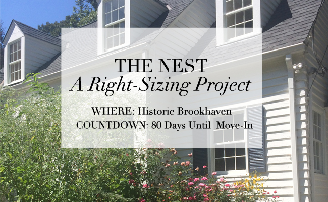
Where: Historic Brookhaven
Countdown: 80 days till move-in
The Cast:
Meg and Scott: the homeowners
Molly and Lily: college and high school-aged daughters
Linda MacArthur: the architect
Michael Ladisic: the builder
(…and a delightful cast of characters who make it all happen with sledgehammers, wheelbarrows, screwdrivers, sheetrock and shovels.)
Progress report: We’ve ground to a standstill figuring out a few last-minute foundation issues for the new addition. Oh, and the day we were going to begin grading, the skies opened. After retreating inside, we tackled a pesky framing issue that affected the vault in the little family room and found a suitable solution that no one will ever notice but us!
The “80/20” rule
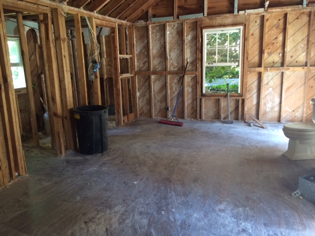
This is our third renovation/build project and we’re finding yet again that the old “80/20” rule definitely applies: the first 80 percent of the project is the unsexy but necessary stuff. The last 20 percent is the glitz and glamour. So, I’m not posting a lot of before pictures because they’re frankly confusing and not very inspiring. Hang in there with me and we’ll start to see progress soon, I promise. In the meantime, I’m soaking up all the inspiration possible from gorgeous photos that I’m finding here, there and everywhere.
Not very inspiring or sexy. The future master bath/closet. It’s the old 80/20 rule.
Mastering the Bath
On the boards this week: the master bath. We’re meeting our cabinet guy this week so we need to have our little duckies in a row. Thanks to the pros in our life (Linda MacArthur, architect and Michael Ladisic, builder) we feel pretty confident about the way things are looking. Linda’s got things pretty well placed on the floorplan and with Michael’s guidance, we’ll be able to nail down the design.
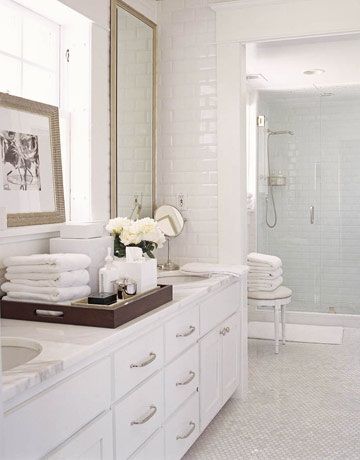
Remember it’s all about small, smart and stylish – and the master bath will be a study of efficiency and pretty, clean and simple design.
This was one of the first inspiration photos I found and I keep coming back to it.
Non-Negotiables
We’ve made a list of the things we just aren’t willing to live without in this little Nest. We’re good giving up the spaces we didn’t use a lot…but sacrifice nice fixtures, a good bubbly tub and a gorgeous aesthetic? No way!
We’ve already picked out the plumbing fixtures and we’re going for a nice mix of high and low (thank you Home Depot, for a couple nice surprises that just happened to fit the bill!) that channels the cottage-chic vibe I’m looking for. Everything in the master bath will be polished nickel whose gorgeous patina I adore. But what about the rest?
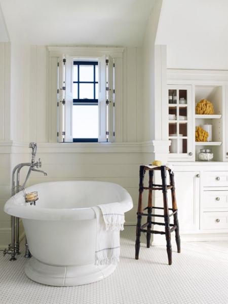
One request from the hubby: a bubbly tub. We’re giving an airjet tub a try this time and we found a nice Kohler one in white, of course. It will sit under a lovely new window and face the double vanity.
I love the cottage-y vibe in this image. It’s so squeaky clean.
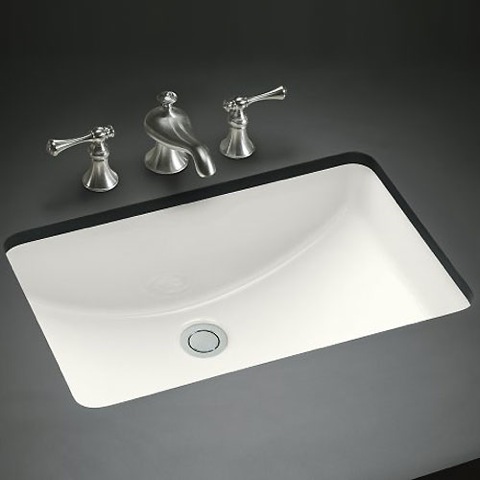
Speaking of the double vanity, that’s also a new experiment for us. The old house has single vanities (one for each of us) and I personally loved having my own little side of the bathroom (next project: his and hers bathrooms? Yes, please!) In the Nest, space is at a premium so we’re doing the double vanity. I’m crazy about the Kohler Ladena sink (a sleek rectangle) so that’s a definite yes.
The Kohler Ladena sink is a YES!
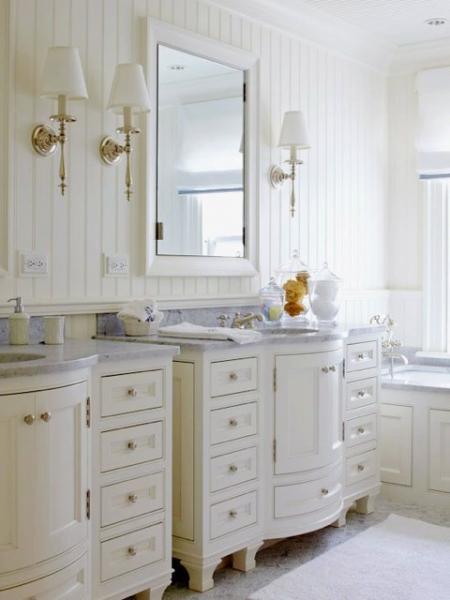
Pretty but I think the Nest is shouting for simple cabinetry.
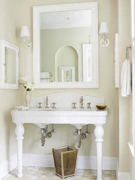
This is gorgeous if space is at a premium. The sinks are awfully close together!
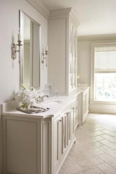
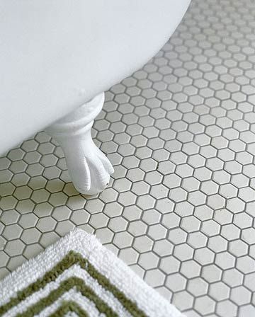
It’s not quite time to decide on the surfaces, but I’m a huge fan of limestone.
I love this monochromatic bathroom. Limestone floors and lots of creamy white paint.
This would a natural for the Nest—maybe we’ll put this in one of the girls’ rooms.
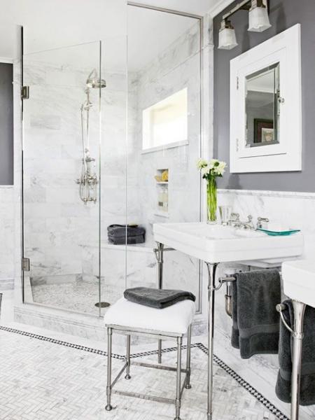
I better not rule out marble. This is so pretty.
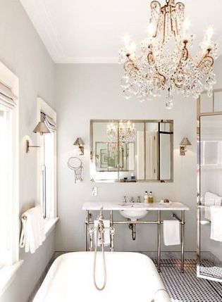
I have visions of fluffy white towels and streamlined accessories. And as for lighting…what about this?
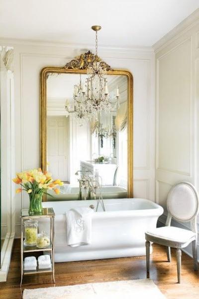
A magnificent Louis mirror and a crystal chandy. I’ve died and gone to heaven.
Somehow the Nest would end up feeling like swanky penthouse…
but what’s wrong with that?
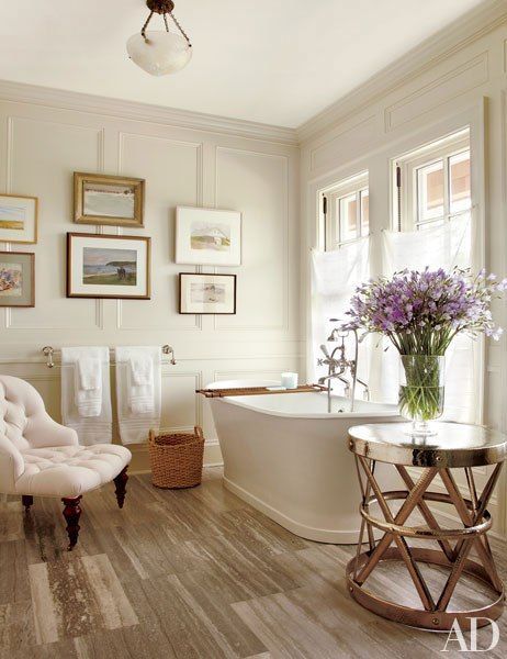
And while we’re talking our dream salle de bain, I’ve always wanted a glorious and interesting art wall in my bathroom.
What’s your bathroom have-to-have? Send me some inspiration!
Next week: footings are poured for the new addition and porch. Fingers crossed it doesn’t rain…
(all images via Pinterest)
Meet Meg: co-owner of Huff Harrington Home and Huff Harrington Fine Art. Certified project junkie and lover of fine furnishings and décor (especially the happy marriage between crunchy antiques and modern art). Loves all the Frenchy stuff—as well as food, wine, books, fireplaces and long quiet afternoons by the pool. She’s married to Scott and has two daughters, Molly and Lily.


