Classic Remix
Designer Barbara Howard guides a young couple to embrace a fresh take on traditional style.

It’s a distinct advantage when designer and client know each other before a project ensues. There’s already a certain familiarity with the client’s “likes” and “dislikes” and, perhaps most importantly, an already-open line of communication.
That’s exactly the advantage Barbara Howard had with Mayer and Beau Buisson. Howard had known Mayer’s mother in college, so the personal connection was already in place. Thus, she was perfectly comfortable being honest with the couple when they first approached her to do some design work for them.
“They called me a few years ago and asked me to come and do just a little bit,” Howard recalls. “I suggested they wait until they were ready to do an entire room, or when they moved. Otherwise, I didn’t think they’d feel satisfied with the results.”
Wisely taking the designer’s advice, the couple did just that, calling her again a couple of years later when they moved to their new home. And what Howard found on her very first visit was a most welcome surprise. “The floorplan was great; we didn’t have to change anything about it,” she says. What’s more, the designer was met with a beautiful blank canvas to work with. “All of the paint colors in the house were perfect—a cream color; we didn’t have to touch them,” she adds.
Howard started by coming up with a master plan and then went back and layered the look—in the dining room, with star-quality pieces like the settee decked out in a huge zigzag stripe. “They’re a young couple and have lots of nieces and nephews, so they were a little worried about the fabric holding up,” says the designer. “It’s just a cotton, but it actually has a thin vinyl coating. You can’t see it or feel it, so it still appears very elegant but is also durable.”
But upholstering the settee in simple cotton was only the beginning of Howard’s casually elegant look. “The Robert Allen fabric on the window treatment looks and feels like a wool cashmere. We did pretty rods, too, with finials that have the perfect pewter/gold/silver patina. And there’s an aged mirror between the windows that opens up the entire room. I love mixing things, like the stone table base with the wood top and the settee’s cotton upholstery with the wool, mirror and iron elsewhere in the room.
“We wanted something that was sort of young but classic, something that wouldn’t date itself. Mayer dresses in such a classic way but then she’ll throw on a one-of-a-kind belt or incredible high-heeled shoes. And that’s what I think we’ve done here. It’s all very classic but then it puts a smile on your face when you see something like that settee.”
In the living room, the challenge at hand was to make it multipurpose. “They wanted a formal living room because they like to entertain,” Howard says, “but they wanted to be able to have a quiet moment there, too, or watch TV together.” To accommodate the latter, there’s a pretty antique piece between the two windows that houses a small television set.
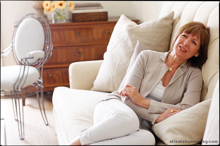
But, like the dining room, this space features a well-balanced mix of things that are more formal—and those that are less so. “For instance, the casual coffee table is from Bungalow Classic,” says the designer, “but the sofa’s more tailored. We had it custom made for the room. And even though the room is done in soft colors, it’s meant to be used.”
Howard’s signature style, understated but always chic, is even apparent in the breakfast room. In lieu of a conventional dining table, for instance, she opted for one that’s tea table height set in front of a banquette sofa. It’s a perfectly comfortable spot for breakfast, a quick snack, even cocktails at the end of the day.
“Mayer, Beau and I were so in sync about this project right from the start,” says Howard. “We listened to each other—and that was the best part.”


