15 under 40: Dayka Robinson
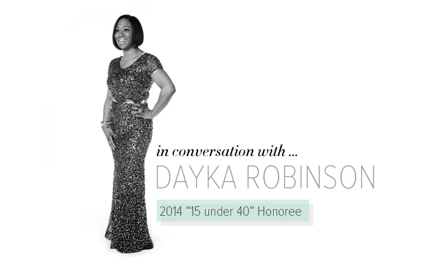
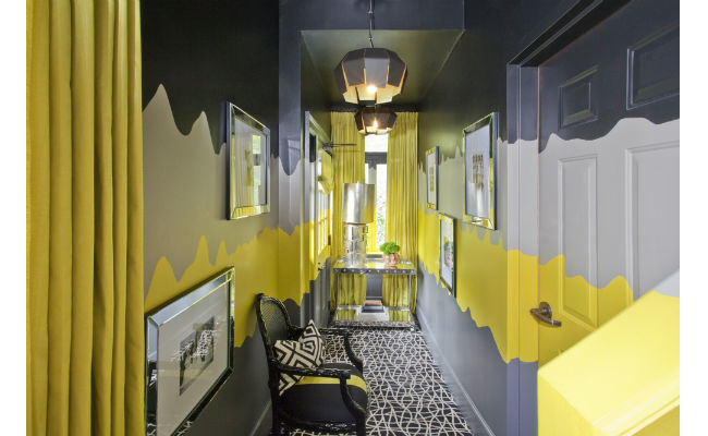
Since launching her blog in 2009 and design business one year later, Dayka Robinson has enjoyed a meteoric rise to acclaim. She’s collaborated with major brands such as Mitchell Gold + Bob Williams, FLOR and Ballard Designs. Her eclectic aesthetic draws shoppers to Etsy and One Kings Lane alike, and has made her a marvelous fit for the production company of Brian Patrick Flynn, with whom she’s worked since 2011. This fall should prove even more impressive for Robinson, who will launch a design-business program called DaykaTV.
What inspired you to begin blogging? Purchasing my first home in 2006. I knew I wanted something I could put my stamp on, but didn’t really have an idea of what to do, so I began to devour design magazines for inspiration. Late one night, after a backbreaking day of DIY renovations, I stumbled upon a design blog and my life was forever changed. It took me a few years to build up the courage to start my own blog, but once I did I was off to the races!
Any important lessons learned from blogging? Just be yourself. The bloggers I love have a certain amount of transparency about their life and business. They share the good and the bad, and they have a strong point of view, even if it’s not always the popular one. I love to write the way that I speak and think a lifestyle blog should be a place where you share your whole self.
You are very social media savvy. How has that engagement helped you? Social media has connected me with so many people, clients, brands and networks that I never would’ve made contact with in the absence of vehicles like Instagram, Facebook, Twitter. By far, it’s been instrumental in building my brand and getting my name (and my work) out on a wider scale. I feel blessed to be a designer in the midst of the social media heyday!
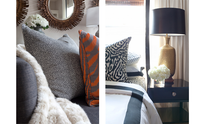
Do you have a signature look and how would you define it? I wouldn’t say I have a signature look, but there are definitely things you can expect to see in my designs. I love clean-lined furniture, graphic patterns, pops of saturated color, great vintage furniture and accessories, lacquered paint and a play on textures. How I use these items can be different in each application, but it’s always important to me that my clients’ spaces not only feel like their home, but also don’t look like they were pulled right off of a showroom floor.
Do you have a favorite pattern or print you return to? I try not to use the same thing over and over, but I’m a lover of prints in general. It would just feel wrong to discriminate!
Tell us a little about DaykaTV. Online, design-based content based on my brand—that’s all I can say!
To view more of Robinson’s work, visit daykarobinsondesigns.com.
{This year’s 15 under 40 class is presented by Matthews’ Furniture Galleries}
