2008 Kitchen of the Year Winners
Grand Prize Winner
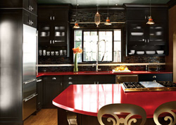
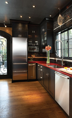
Flair for the Dramatic Glass tiles, stainless-steel surfaces and spectacular lighting make this space shine.
The Vision: The clients had high expectations for this renovation, says Jim Meloy of Kitchen & Bath Concepts in Roswell. “The space had to be fun—unique like the rest of the house—and it had to have good access to the pool and patio. They needed to fit in a small office for her and wanted an audio-visual system. Plus, a dramatic lighting system was a priority.” The challenge? Fitting all of those requests into the existing 120-square-foot kitchen.
The Result: Plans went through several incarnations, but in the end the decision was made to move the kitchen entirely—and a couple of other rooms, too. “We moved the kitchen to the former dining area, which allowed us to open up a wall and install a door that accesses the pool and backyard,” Meloy explains. “The original kitchen is now a breakfast area plus bar, and what was the bar became an office.” Just as important as function, though, was the ambience. The owners were looking for an “old Hollywood” feeling, achieved with this kitchen’s dramatic use of red and black, spectacular lighting, glistening glass tiles on the wall, and stainless-steel surfaces with a gleam of their own. “It’s a ‘wow’ space,” says the designer, “which is exactly what the owners wanted.”
Essential Elements:
1. Listen to the client; inventory requirements.
2. Create tailored solutions; come up with several different ideas based on the client’s criteria.
3. Provide interpretive drawings, perspectives and elevations; show the client exactly what to expect.
4. Put yourself in the client’s place; imagine how you would feel if the same work were done in your home.
5. Meet—and exceed—expectations; how the project gets delivered means everything.
DESIGN DETAILS
Jim Meloy, CKD
Kitchen & Bath Concepts
(770) 442-9845
RESOURCES
Cabinets, Holiday Kitchens IDC Series
Countertops, CaesarStone
Lighting, C Lighting
Door, Castle Entries
Refrigerator, Freezer, SubZero 700 Series
Double ovens, warming drawer, cooktop, Wolf
Dishwasher, Bosch
Trash Compactor, KitchenAid
Microwave, GE
Glass tile, Traditions in Tile
Design and lighting: Rose Arispe Black and Scott Black, GO Productions.
Runner-Up
Visual Weight
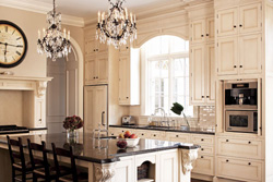
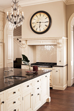
A former cookbook editor gets the ample storage space she’d always wanted in the form of floor-to-ceiling, furniture-like cabinetry with decorative details.
The Vision: The client of Mary Kathryn Calonje had especially close ties to her kitchen. As a former cookbook editor, she needed ample storage space for all kinds of dishes and serveware—as well as the many cookbooks she’s collected. To that end, she requested to-the-ceiling cabinetry in an elegant space befitting her Georgian-style home.
The Result: Installing cabinetry all the way to the ceiling wasn’t the challenge, says Calonje. Keeping it from feeling overwhelming in this high-ceilinged space was. The central island helps provide the much-needed balance, its honed black marble top adding even more visual weight. At the same time, decorative details—fluting in the columns, the bases, the frieze—tie everything together into one cohesive whole. The cabinets themselves, featuring recessed panel doors in beaded frames, are lightly glazed and accented with oil-rubbed bronze hinges, elevating their status from functional to fine furniture. So it’s only fitting that a pair of chandeliers illuminates the space, providing the finishing touches.
Essential Elements:
1. Respect the architect’s vision; come up with a plan that supports the design.
2. Take an element from the architecture (interior and/or exterior) and repeat it throughout the kitchen.
3. Create a kitchen design that’s timeless, not trendy, because kitchens are typically remodeled only every 15 to 20 years.
4. Provide a beautiful focal point as well as a place for the eye to rest, so that focal point can shine.
5. Be mindful of the scale of the space and surrounding rooms, and choose materials with the appropriate visual weight to complement the space.
DESIGN DETAILS
Mary Kathryn Calonje
Design Galleria Kitchen & Bath Studio
(404) 261-0111
RESOURCES
Contractor, Braxton Construction
Cabinetry, Downsview Kitchens
Faucets, Perrin & Rowe
Refrigerator, freezer, refrigerator drawers. SubZero
Range, AGA
Runner-Up
Systematically Social
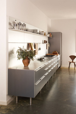
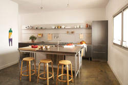
A mix of freestanding and built-in cabinetry makes for a personable, minimalist design.
The Vision: The client of Bulthaup’s Adrienne Grzeskiewicz was looking for a new kitchen that “she could take with her if she ever moved,” says the designer. “It’s a very European concept, and that’s what drew her to us—Bulthaup is a European system.” At the same time, the client wanted lots of counter space and a room conducive to interacting with friends, too.
The Result: “The client liked both lines that we carry, so we ended up blending the two,” says Grzeskiewicz. “The island is ‘System 20,’ which is freestanding, while the base cabinets were created from our ‘b3’ line of built-ins.” The result is not only a hybrid collection of cabinetry but a hybrid layout, too. The orientation of the space is like a galley kitchen, but it’s open, giving it a social aspect as well. The finished kitchen responds to the architecture of the loft space.
“It’s an incredibly functional kitchen, but it also provides the framework to interject personality with her collection of art and pottery,” the designer says. “There’s a way to display and use everything. It proves that minimalist design doesn’t have to be cold and uninviting. You can have something that’s minimalist and personable at the same time.”
Essential Elements:
1. Allow the architecture to inform the kitchen design but also allow the needs/desires of the kitchen to inform the architecture.
2. Pursue a kitchen design that meets your needs and lifestyle but also embraces aesthetics and functionality.
3. Think about kitchen design in terms of space planning—not just kitchen planning; today’s kitchens are really living spaces at the central core of any home.
4. Select appliances carefully; they are your essential “tools.”
5. Personalize your kitchen, creating a space for memory-making moments.
DESIGN DETAILS
Adrienne Grzeskiewicz
Bulthaup
(404) 228-4191
Runner-Up
Warm & Inviting
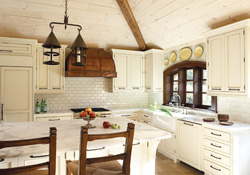
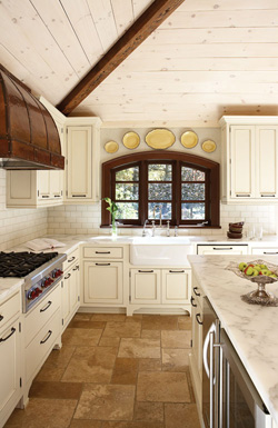
Well-chosen, textural materials and architectural elements make this space as visually pleasing as the adjacent living room.
The Vision: Architect John Hopkins was asked to create a timeless kitchen, one that was warm and inviting but had a more spacious feeling, too. The challenge was to keep it within the kitchen’s existing footprint. At the same time, the space needed more light to make it a brighter, cheerier place.
The Result: Vaulting the once 8-foot ceiling up to the hipped roofline immediately makes this a more spacious place. White-washed knotty spruce ceiling boards are accented with antique timber beams, adding Old World warmth while visually connecting the kitchen with the adjacent family room. But the ceiling doesn’t get all of the credit for this kitchen’s success. Equally important is the light that now floods the room, thanks to a new window. Hopkins took an existing window as a starting point and expanded and arched it. The result is not only more daylight but also a better view of the owners’ garden.
The new window also allowed the architect to reorient the kitchen, putting a farm sink in front of the window and a commercial-style gas cooktop on the side wall, topped by a hand-hammered hood. The gleaming copper reflects the light, as do the white-washed ceiling and new limestone floor. “It’s a very functional kitchen,” says Hopkins. “The cook can be working in the dedicated zone and socialize with others sitting at the island or dining table, too.”
Essential Elements:
1. Listen carefully to the client.
2. Consider options that are creative, ways of looking at the space that the client probably hasn’t thought about.
3. Integrate the renovation into the existing house so it looks like it belongs, so you don’t recognize it as an addition.
4. Take into consideration the light and views from the space.
5. Focus on traffic circulation, how the space is used.
DESIGN DETAILS
John Hopkins
John Hopkins & Associates Inc., Architects
(404) 843-4889
RESOURCES
Interior design Nancy Warren Interiors Inc.
Cabinetry Kitchen Designers Inc.
Contractor J.V. Page Construction
Our Judges
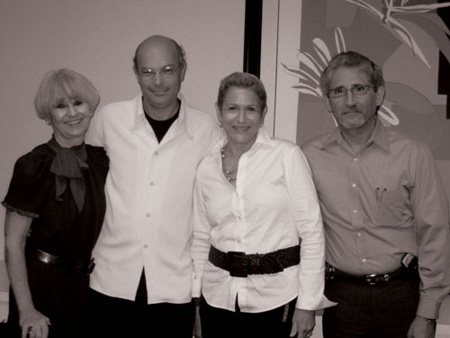
Jackie Naylor, Interior Designer, CMKBD
Known for her dramatic design and decorative flair, interior designer Jackie Naylor founded her company, Jackie Naylor Interiors Inc., more than 20 years ago and has won various awards and recognitions at the local and national level. A Certified Master Kitchen and Bath Designer, Naylor’s projects have been published in House Beautiful, Better Homes & Gardens, Atlanta Homes & Lifestyles and other magazines.
Stanley Kopkin, CKD
For 35 years, Stanley Kopkin has been in the business of remodeling kitchens and baths and has been a Certified Kitchen Designer since 1987. He has designed rooms for a wide range of homes, from high-rise condominiums to single-family and custom-built homes. He is currently a designer with CSI Kitchen and Bath Studio.
Joye Hirsch, Interior Designer
Interior designer Joye Hirsch has turned her two loves, cooking and design, into a successful business. She received her degree from Georgia State University and has owned her own company for more than 22 years. She loves designing kitchens and baths, so much so that she once took on a home with 12 bathrooms! She has completed projects all over Georgia, in Tennessee, North Carolina, New Jersey and New York.
William T. Baker, Architect
Founder and principal of William T. Baker and Associates, William T. Baker has designed classic homes since the mid-1980s. Known for his timeless designs and family-friendly living spaces, Baker has been published in various national and regional magazines. He’s participated in the Atlanta Syphony Associates’ Decorators’ Show House and the Golf Digest Show House at Reynolds Plantation.


