Bold Strokes
Produced by Clinton Ross Smith
In a perfect world, two people meet, fall in love, get married, and live happily ever after. That is, until the time comes to combine their separate homes into one living space. It’s not something wedding planners will tell you, or even your parents, but trying to merge two schools of thought on home design, or style in general, can seriously strain a relationship.

A young Atlanta couple, hoping to sidestep the stress before they tied the knot, sought an interior designer who could blend the wife’s penchant for a beachy, feminine look with the husband’s darker, contemporary pieces. They asked friends and family for a list of prospects and one name appeared on all the lists: Liz Williams. The couple had seen some of Williams’ work and quickly offered her the job.
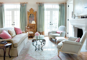
With a wedding looming, Williams wasted no time. “I started out by asking them to pull magazine pictures that they both liked,” says Williams. “Then I reviewed the pictures and tried to find a common thread that would please them both.” Williams soon learned what drew them both to this house: natural light. Every room is washed in sunlight and Williams wanted to maximize that, as well as create a look that seems to have been collected over time.
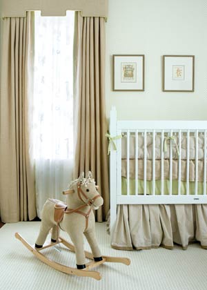
Even though their styles are different, the couple agreed on one thing. “We’re young,” says the wife, “so we didn’t want it to feel stodgy, plus we knew we wanted to have a family, so it had to be livable, too.”
Not long after Williams began working on the renovated, 1906 Ansley home, the couple was married and left for a month-long honeymoon. While they were traveling through Europe and Africa, Williams was in Atlanta, choosing fabrics and scouring the city for what she called ‘investment’ antiques – solid pieces that the couple will cherish forever. “Pairing traditional antiques with fresh, not-too-trendy fabrics keeps interiors young and classic,” says Williams.

The main level of the home hosts the pale blues and greens that the wife prefers, so to create balance, Williams added rich walnut pieces to warm up the rooms and bring in the eclectic look the owners wanted. A late 19th-century walnut sideboard made its way into the dining room, anchoring the green and gold. Williams also customized the wallpaper to the couple’s liking. “It took two or three runs until we got the color right,” she says. And while the clients didn’t have much to start with, their table and chairs fit perfectly into the dining room with a little help from a Bergamo fabric.
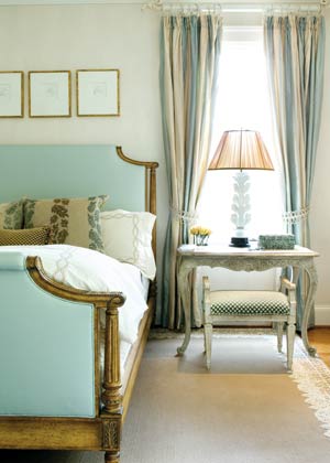
Upstairs, the master bedroom keeps to the green and gold palette, though it feels more feminine than much of the house. With velvet on the bench, silk on the windows, and wallpaper in a color called satin, the subtle textures create a rich look, without overwhelming the eye.
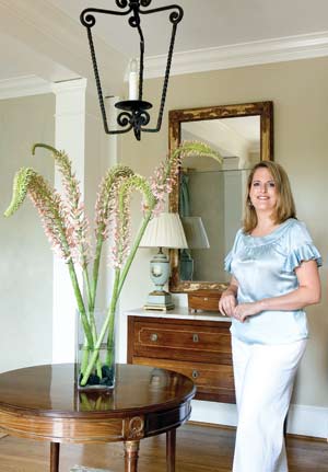
“I have to say, Liz was pretty talented to find things that would please both of us,” says the wife. But there were times when things didn’t fall into place so easily. “We went through 13 different mirrors for the entryway, but in the end [Williams] found one that had a little masculinity, and was pretty, too.”
Sixteen months after Williams was brought into the home, it’s finished – for the time being. “There are still rooms that we want to work on,” says the wife, “but for working with a newly married couple still learning each other’s tastes, she nailed it.”
DESIGN DETAILS
Interior Design, Liz Williams, Liz Williams Interior Design, (404) 816-9868


