


Paint Panache
Atlantan Byron Blake may have studied English and psychology at the College of William & Mary but—as a decorative painter and designer—he's completely self-taught. A voracious reader of design publications, he uses his knack for color psychology and his gift for words to address clients' needs, picking the perfect shades and superbly articulating every design decision along the way. This screen porch floor, a recent project in Decatur, is the perfect example; its chic and mod vibe perfectly suits the home's new look.
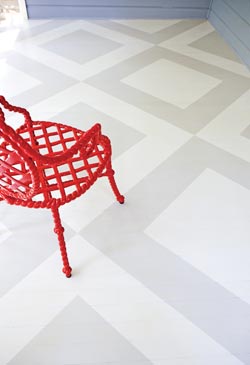
On the painted floor designed by Byron Blake, Veneman Furniture’s St. Germain arm chair by Roger Thomas. available through Logan Gardens, ADAC, (404) 231-4808.
AH&L: This is such a chic floor! How did you come up with this design motif?
Byron Blake: We wanted to do something that had a formal look to it, but take it out of a more traditional setting and transpose it to an outdoor deck. I decided on this classic, Billy Baldwin-type design. It’s very Hollywood Glamour … and the two shades of gray make it unexpected. Most people would have chosen to do it in very graphic black-and-white, but we wanted to tone it down, knowing that it would be a backdrop for the furnishings and the quiet outdoor scenery.
I can see the Billy Baldwin influence here, but there’s something more modern about your designs, too. Where else do you get inspiration?
I use David Hicks a lot, and lately I’ve been getting a lot of ideas from different wallpaper companies. What I’m looking into now is blowing up different wallpaper motifs—like florals—to a super-sized scale. But my inspiration comes from everywhere. I tear out pages from magazines, use fabric samples and tile, and great, classic designs that I play with to create something different.
Do you ever have designs just come to you? Do you ever wake up from a dream and have to sketch something out?
Continuously. Sometimes I’ll see something on TV and sketch it out really quickly because, knowing me, I’ll forget it if I don’t. For this reason, I have a sketchbook in nearly every room of my home, even the kitchen. Even though I won’t use the exact design, it often leads to something else that I can apply creatively to another idea. It’s a starting point.
And paint is such a practical alternative design solution!
Exactly. I think paint is one of the easiest, most inexpensive ways to change your home. A lot of people don’t have $30,000 to renovate a room, but they do have $2,000 to do a really spectacular facelift with paint. It’s also kind of a mental thing for me. It brightens your disposition to have things looking fresh, clean and new. You react to rooms differently; you feel better in them.
Do you have any tried-and-true colors that you just can’t live without?
I’m addicted to the Benjamin Moore collections for Pottery Barn, and lately I’ve been going back to Ralph Lauren colors. Their Candlelight line is great. I’m using one of the Candlelight shades in a client’s home right now.
You seem to specialize in digging people out of a neutral niche and getting them to experiment with color. How do you convince them to come around to your corner?
I try to talk to my clients and find out how they feel. You can’t just force a color on somebody; a drastic color change can be shocking. I see how they feel about a color, and how well that fits with the other elements in their life. I present a few of my favorite shades to them, and we narrow down from there. I always have one that I know is the best choice and, thankfully, they usually come around to it. I spend so much time with my clients—talking to them about their lives and their homes—that we become like family!
How do you get your designs to come out so flawlessly?
In this case, I used the architecture than Jason and Katie Isogna, of Rubicon Construction, built for us. I lined up my diagonals by centering each point in the middle of the five-inch beams. It’s important to use existing architecture to inform scale; it all kind of weighs together, so it looks right. I’m a perfectionist, which is probably why my business is still a one-man operation—which most of my clients like. I select colors that coordinate with everything in the home, not just one room. It has to flow. There’s so much more to it than just saying, ‘Oh, I want a red dining room.’ I like to find colors that mesh, on both the interior and the exterior.
What special techniques do you use to give your floors such a professional look?
It’s very time-consuming because, with a floor, you’ve got to roll it and leave the room. You can’t walk on it for 24 hours, so it’s one coat per day. I start by sanding and applying two coats of primer, then three coats of the lightest color and three more of the darker color. I get clean lines by measuring everything and masking it off in accordance with the architecture of the room. Thinking about which side gets painted and which side doesn’t gets confusing halfway in, because you’ve got blue tape over half the floor and it can look like a big ol’ mess. But once it’s taped off, that’s the easy part—you just roll over it three times and go.
I love the subtlety of this design. Do you ever paint anything more elaborate on floors?
Not really. I don’t want the floor to overpower the rest of the room. I know it’s going to be walked on and, if it’s too precious, people are going to feel weird on it. I want the dog to be able to lie on it. I want furniture to be scooted around on it. If it’s too elaborate, then my clients are going to feel strange walking on it.
It’s an exquisitely simple look, but how do you keep it looking fresh over time?
Where you walk the most, it will start to wear away. I think this particular floor is still a little too perfect. I’m almost ready for the edges to fray a bit, and they will eventually. To protect the floors, I always use three coats of varnish, and brush each plank individually by hand; it’s very time-consuming. If you roll it, you get little bubbles underneath the surface. It takes about a week to do a standard-size room; that’s why it costs what it does for this treatment, because it’s a solid week of back and forth [labor]. And that’s after we’ve chosen the design, chosen the paint colors and worked out all of the other details. For upkeep, I recommend re-varnishing every year to a year and a half, just to be safe.
DESIGN DETAILS
Byron Blake
HomEdit
(404) 372-5527
[email protected]
CONTRACTOR
Rubicon Construction
(404) 556-6693
rubiconcnst.com