Small Spaces: Second-home Treasures
Designer Alice Cramer creates a turnkey interior for a downsizing couple by giving their favorite pieces a new look.
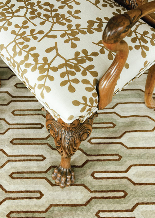
The graphic-yet-classic patterns on the living room’s rug and Chippendale chair add artful interest to all the right places in this Buckhead home.
Small Scale, Bold Style
Like many now making the urban migration, Alice Cramer’s new clients were looking for a second home with as much high style as low maintenance. A place well suited for entertaining but one, too, that could be turnkey when they wanted to take off for the beach and beyond.
They found just the right Buckhead residence but needed their designer’s deft touch to make it live larger than its diminutive dimensions. “Editing was very important here,” says Cramer. “The clients came from a house full of furniture and personal items but were moving into a much smaller space.” The challenge for this designer went beyond merely dealing with minimal square footage. The empty nesters wanted to use some of their most treasured pieces but end up with a residence that looked totally different from their previous ones.
To give this couple their desired décor—a transitional blend of old and new—the designer started by keeping the basic architecture intact but replaced existing wood flooring with more reflective surfaces that would enhance light streaming in through floor-to-ceiling windows. From there, it was a matter of selecting a few new furnishings, updating old ones with fresh fabrics, and finding creative ways to incorporate storage.
“At the end of the day,” says Cramer, “this condominium is a blend of favorite pieces from their previous home that have been given a fresh new look.
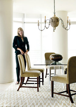
Dining Room
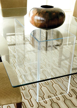
The dining room, says Cramer, came together quickly upon the selection of the rug; the custom-colored floor covering in subdued shades of beige and blue adds just the right—and unexpected—touch of contemporary flair while staying true to the neutral palettes of the adjoining rooms. “Because we loved the design of the rug so much, we decided on a glasstop table with an acrylic base to be able to have full view of the rug’s design,” says the designer. The bonus is that the see-through dining table also takes up minimal visual space, one of the best tricks of the trade when dealing with limited square footage. What’s more, the clear table allows more focus on the armless chairs, which in turn take on a sculptural quality. Another challenge in this space, says Cramer, was dealing with a pair of large structural columns. “After much debate, we decided to simply fill the space [between them] with a beautiful rustic planter and lush green plants,” she explains. “I think it came off nicely and filled in an awkward space.”
Living Room
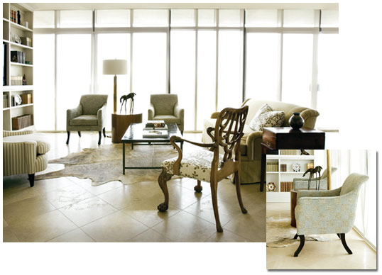
In lieu of the original hardwood floor, a lighter, brighter travertine brings a space-expanding quality to the living room. Cramer and her clients agreed, too, that the oh-so-traditional fireplace in this space had to be removed. In its place, minimalistic bookcases were added; stretching from floor to ceiling to take advantage of every vertical inch, the shelves provide ample room for a TV, treasured collectibles and volumes of books. The storage solution left plenty of floor space for furnishings, but the scale had to be just right. “We wanted all of the seats to be comfortable for watching TV—and both clients are tall,” she explains. To that end, a high-backed sofa was used to anchor the seating group, with a pair of upholstered Rose Tarlow chairs on one side and a classic Chippendale armchair on the other. The latter, one of the pieces that the clients brought with them from their former residence, gets a fresh update, too, with a stylized floral fabric, carrying the soft colors that predominate the overall palette.
At the end of the day, this condominium is a blend of favorite pieces from their previous home that have been given a fresh new look.
Master Bedroom
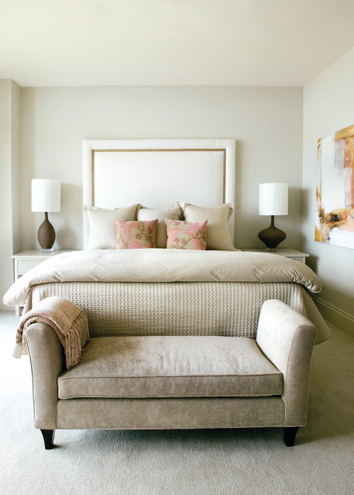
The design of the master bedroom stemmed, quite simply, from the clients’ desire for an upholstered headboard. “Because of the ceiling height, we were able to create a taller headboard, putting a more modern twist on it,” says Cramer. Centered on one wall, the ribbon-trimmed headboard provides the starting point for a perfectly symmetrical setup; twin tables and lamps on either side of the bed—and a comfortable bench centered at the foot—create a sense of balance that’s particularly soothing in a bedroom. On the opposite wall, the designer turned once again to space-efficient, built-in storage that holds everything from clothing to home electronics and even incorporates a desk. “My approach to design is not about matching but more about finding a way to place items and
make choices that are less expected,” says Cramer, “with the end result being pleasing to the client and interesting to the eye.”
ALICE CRAMER on …
Designing Small Spaces
Don’t be afraid to use large-scale furnishings; they can actually keep a space from feeling small.
When downsizing, purge and edit; reduce clutter by taking with you only the things you really need.
Be consistent with a color scheme; likewise, use similar finishes on surfaces such as flooring and paint.
Think creatively in terms of storage: look for opportunities to add shelves or built-ins for personal items and clothing.
DESIGN DETAILS
INTERIOR DESIGN
Alice M. Cramer Interiors
(404) 355-3797


