


The New Hues
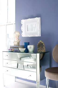
An interior featuring French Violet, from the Pure Opulence collection.
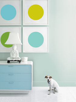
A room painted with Green Tint, from the Modern Tranquility collection.

Benjamin Moore Color Specialist Stephen Bernasconi
AH&L: What colors will we be seeing the most of in 2008 and 2009? Are color trends going a particular direction?
Stephen Bernasconi: Colors this year can be gray, bright, soft or neutral. The real question to ask is not ‘Are neutrals going to be en vogue?’ but ‘Which ones? What are the bright colors we will be seeing? What are the grays?’ We have several color palettes and lots of options within them. Our Modern Tranquility collection, for example, is inspired by sheer, silky fabrics, pearlized finishes and the reemergence of crystal, glass and Lucite. These colors are classic and subtle and lighter than air.
How do you pick new Benjamin Moore color palettes? Do you develop new colors to reflect new trends?
If I go to a trade show, and they’ve launched a new fabric, I look to see which Benjamin Moore color it is closest to. We have many colors, and they’re not all trendy at one time, so once we know what’s trendy, we go to our palettes. We saw a lot of this particular color, French Violet, at the trade shows. We could have pulled any of our purples, but we thought this was the best one to represent it. We also just launched 140 new Affinity colors for our Aura Paint line, so we now have 3,500 colors to choose from, but limitless possibilities.
Where do the presenting manufacturers get their color ideas?
Designers are inspired by social movements. The eco trend is a great example. Before there were eco colors and eco materials, like cork and jute, there was concern for the environment. This social trend has led to product development. We see it with hybrid cars, building materials and even mineral makeup.
Being a North Carolina native, your perspective is local as much as it is global. Do you see a connection between international trends and those in the South?
I notice this wherever I go because I travel to so many cities. We see trends around the world, but where they’re really happening is locally. We don’t bring trends to Atlanta and say, ‘You have to do what people in Milan are doing.’ What’s interesting is that you can go to any decorating center in the world, and while the trends will translate differently, there’s a common thread. The South is legendary for its tradition, but here, you see looks interpreted in new ways. Take a traditional brocade fabric, for example; you’ll still see the slightest color shift with changing trends.
Do you have any current favorite colors?
I do not pick favorites, but overall I’d have to say those that are inspired by nature. They don’t have to be the colors of trees; they can be gems and amber, or the colors of sulfur or Georgia clay. This idea is fueling one of the biggest color groups right now, which we call Organic Comforts.
Blues and greens are so classic; do you consider these constants?
Some blues and greens are classic, but whether they are thought of as trends comes in cycles. A color that’s classic can also be a trend color, and vice versa. Take Rockport Gray, for example, which is in our Pure Opulence collection. This is a Historic Color that goes back to the founding of our company, but it is also a trend color. Even things from the past can come back and emerge once again.
What colors are worth designing a room around?
Any color. You have so many choices, but whether a color is a good or bad choice has to do with what you want to accomplish. Can you design a room around bright red? Absolutely. But it doesn’t have to be on the walls. It can be on the rug. If you want bright red to be the centerpiece of the room, you may want to paint the walls a soft neutral—then the rug gets to be the leading color. If you want a neutral rug to keep for a very long time, you can play with color on the walls.
What would you say to a homeowner who prefers to stick with beige or white?
White is wonderful, especially if It is part of the concept of tranquility. But don’t use white as a default because you’re afraid of color. If you’re going to use a neutral, use it as part of a design statement. Paint is one of the smallest investments in color change you can make. Brush a color sample out on the wall, leave it up for a week, switch it out, take your time. I actually paint samples on foam board so that I can move them around my house in different light. Some colors will speak to you if you give them time.
How do you update the color of a room without redecorating top-to-bottom?
Look at a room and ask yourself, ‘Do I want to change the whole look, or find a color to go with something I just bought?’ If you’re making a change, the first thing you’ve got to do is decide what stays and what goes from the room. Once you decide what’s going, remove it from the room. Deciding what color you ultimately want depends on what mood you’re after.
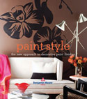 Paint Style ($26.95, Smallwood & Stewart Inc.) is the newest design book from the creative authorities at Benjamin Moore Paints, presenting the freshest and hippest in paint finishes and decorative techniques.