New Guest Blogger Series: Matthew Quinn
Editors’ note: To kick off showhouse season, we’ve asked Matthew Quinn of Design Galleria Kitchen & Bath Studio for a sneak peek into the firm’s design process as it prepares for the opening of the 42nd annual Decorators’ Show House & Gardens, presented by the Atlanta Symphony Associates, on April 20. Check back each week for a look at how the spaces transform””from inspiration to reality.
I have always been taught that you learn more by listening than talking and asking too many questions. I knew the kitchen and bath designs for this architecturally significant home would be whispered to us if we just “listened” to the house. As we quietly strolled through this elegant and grand home, we could not help but notice the plethora of exquisite moldings, spectacular panel designs and ahead-of-its time nuances. The challenge will be how do we respect and give honor to what once was while modernizing the house with new materials and technology. The symmetry and proportions of this home were the loudest voices we heard. The boldness of the moldings was the choir and the consistency and simplicity of the materials was the orchestra. Therefore, each design whether for a bathroom or the kitchen had to be symmetrical, balanced and of a proper scale first, include a relative amount of bold moldings and details second and contain a common element of appropriate materials third.
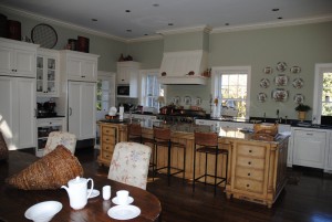
Here’s a quick look at the before kitchen of the 2012 ASO Show House:
A long narrow almost French Country island divides the kitchen from the breakfast room. The hood and windows are out of proportion to the tall ceilings. The back door interrupts the traffic flow of the cook and the refrigerator is hinged incorrectly.
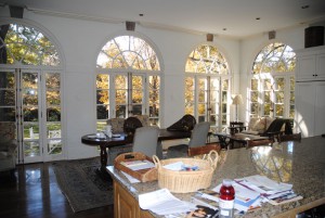
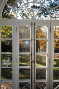
Amazing arched windows overlooking the front yard flood the breakfast room and kitchen with natural light.
Stay tuned for next week’s kitchen update!


