


Inspiring Spaces
In the deft hands of twenty designers at this year's Cathedral Antiques Show's Inspiration House, fine antiques, mid-century objects and vintage finds never looked as new
Keeping Room // Laura Walker Baird, Verde Home by Laura Walker


What was your inspiration for this space? We started with the rug, which is 50 percent silk and in a calming color palette. With the loft-style sofa, both of these foundation pieces gave us the feeling of ‘comfortable luxury’ that we wanted to convey. What were the challenges of working in the space? The biggest challenge was that the family room opens directly onto the kitchen. Also, it is not a large room but needs to accommodate the largest number of people in the most comfortable way. We had to be economical. The fireplace is also a focal point, and is directly opposite of the kitchen, making furniture placement a bit tricky. How do you describe the color palette in your space and why did you choose it? We wanted the room to feel warm and cozy. Since the space is directly off of the kitchen, it’s likely that it would be used consistently by a family throughout the day. We wanted to successfully marry contemporary pieces with antique elements, so the color palette was very important. We chose a purple-pink tone for the walls to give it a youthful flair, which was toned down with gray on the ceiling and on the backs of the built-in bookshelves, giving it sophistication and balance. What did you want visitors to take away from your design? That you can put a very contemporary nickel chandelier in front of an antique mirror and not have it feel out of place. Successful design is all in the curation, and, thus, it’s the collection of the individual pieces that make a room personal and alive.
A pair of Sicilian armchairs, circa 1840, flank a painting by Bernd Haussmann, who is represented through Emily Amy Gallery. A Tuscan armoire, circa 1698, stands out against walls painted in Organdy by Benjamin Moore. The ceiling is painted in Benjamin Moore“s Smoke Embers. An ikat runner is draped over a modern chair. Framed antique prints serve as a focal point in the keeping room. The fabric for the curtains is by F. Schumacher. Unless otherwise noted, all of the room“s furnishings, including the silk-and-wool handwoven Tibetan rug and Gus Modern sectional sofa, are available through Verde Home by Laura Walker.
Kitchen // Design by Hammersmith; Styling by Mimi Williams, Mimi Williams Interiors


The kitchen of the Deanery at the Cathedral of St. Philip was completely remodeled last year by Hammersmith, a residential remodeling and design-build architectural firm. Sleek cabinets, concrete countertops and a glass tile backsplash brought contemporary, European styling to the 1980s-era home. The commercial-style appliances are by Wolf and Sub-Zero. For this year’s Inspiration House, Designer Mimi Williams juxtaposed the room’s clean, modern lines with contemporary art, sculptural accessories and overscaled objets d’art that feature a bit of patina and age.
With access to the kitchen accessible from the dining room, foyer and adjacent family room, the space is at the heart of the home, both figuratively and literally. The double windows above the sink feature views of the back terrace and courtyard. All art, furnishings and accessories are available through Mimi Williams Interiors.
Dining Room // Amy Morris, Amy D. Morris Interiors


How do you approach the design of a room? The client is usually the inspiration because the space should really be a backdrop to how they live. In this case, however, since there wasn’t a client, we took our cue from fashion. What particularly inspired you in fashion? Color and prints, with the main print being the zebra rug. What were the challenges of working in the space? The only real challenge was having a vision for a single room rather than having it flow with an entire house. Since it wasn’t truly in conjunction with the other rooms in the house, we really had to create something that would pop. How do you describe the color palette in your space and why did you choose it? Bold and rich. We found fabrics that were an exact match to a fashion advertisement we had seen at the beginning of the season. We then took those fabrics to the paint store to be matched. What did you want visitors to take away from your design? A good color palette will always leave a lasting impression. What’s your favorite thing about your room? The bold color combination that provides a dramatic backdrop for the antiques.
A “Tears of Ireland” oval mirror hangs above a Regency-style bookcase. Both are part of a pair and available through Parc Monceau. The crystal hexagon buffet lamp is from Circa Lighting. Venetian walnut dining chairs, circa 1760, are from A. Tyner Antiques. The Gothic-style six-light gilded lantern and mid-century gilded-and-black iron sconces are from Parc Monceau. The “Sepia Ink Spot” artwork is by Mora Robinson, who is represented through Belvedere. A French settee from Parc Monceau is adorned with antique Verdure tapestry fragment pillows from Foxglove Antiques & Galleries. Italian carved panels, also from Foxglove, hang above it. The paint color is custom and the Asian-style screen, zebra-print rug and stone table are from the designer“s own collection.
Living Room // Rick Anthony Bonner, Bonner, LLC


How do you approach the design of a space? I never design any room in a vacuum. I begin every project by learning about and understanding the family who will inhabit that space and how it relates to the home as a whole. For this project, the living room serves as a hub for a family who prizes its time together creating and enjoying music. What were the challenges of working in this space? I couldn’t have asked for a better space architecturally, for its placement within the house, or for the amazing windows that flooded the room with natural light. How do you describe the color palette in your space and why did you choose it? The color is crisp and elementally neutral, favoring form as the expression. I chose the palette—grounded by walls in a pure, bright white—to place emphasis on the forms of the individual elements of the room, as well as the composition and utilization of the space. What did you want visitors to take away from your design? I wanted visitors to learn that interior design can be transformative, helping people live their best lives. There is no singular definition of a ‘living room,’ and I want visitors to understand that the right living room for them is the one that reflects the way they live.
The Slice wall hanging in the living room is by Phillips Collection. A pair of Ward Bennett Sled Chairs and a roll arm settee, all from Geiger International, sit atop a Peshawar wool rug from Moattar Ltd. The Tibetan Lamb pillows, Swedish Art Deco end table and spatter-glazed vase table lamp are from Bjork Antikt & Studio. The Walnut Slat Bench coffee table, Bavarian porcelain vase and West German ceramic vase are from City Issue. The round magnolia wood pedestal table and crystal obelisks are from Summer Loftin Antiques. The table is surrounded by chairs from Mimi Williams Interiors. The magnolia prints are by John Mariana. Framed folk art portraits are by Lois Curtis.
Library // Lindsey Coral Harper, Lindsey Coral Harper Interiors


How did you approach the design of the library? My jumping-off point was the carpet. I wanted to do a rich, jewel-toned room, glossy from floor to ceiling. So when I found the inkblot carpet from Doris Leslie Blau, I flipped! It looked like a Rorschach, so I thought that my room could double as an ‘in-home shrink’s office.’ How do you describe the color palette in your space and why did you choose it? The color in my room was Mulberry by Benjamin Moore. It is a beautiful deep pink-plum color that I pulled out of the carpet. There was only a smidge in the carpet, so I ran with it. The carpet had other rich colors and a lot of platinum, so I mixed in black and white to balance it. What did you want visitors to take away from your design? Several things. I love the unexpected, and I wanted to take your typical library and turn it on its head. It’s okay to push the envelope and go a bit modern in a traditional space. A bold, rich color can work in a small room. Hopefully, it made people realize that it’s OK to think outside of the box. What’s your favorite thing about your room? That’s difficult. I love the paint color and the carpet was divine, but that chandelier was pretty dynamite. And that curtain fabric—ooh la la!
The Tony Duquette California Sunburst Chandelier is from Remains Lighting in New York. The paint color is Mulberry 2075-20 by Benjamin Moore. The valance fabric is Silver Satin by Pindler & Pindler. The black leather-and-square metal nailhead trim on the valances is by Samuel and Sons. Curtain panel fabric is India by Elitis. The wallpaper lining the back of the bookshelves is Pheasant by Twigs, a Venice, California-based company. Dan Edge hung the wallcovering. The black and white leather bound books were provided by E. Lawrence Ltd. The large painting is by Jen Bradley, represented through Emily Amy Gallery. The Rorschach-style paintings are by Jay C Lohmann, New York. The carpet is Madagascar by Doris Leslie Blau, New York. The vintage desk if from Parc Monceau. The ottoman is from Mid-Century Antiques in Stamford, Connecticut, and the custom slipcover was created by Genesis Upholstery, New York. The lamp is by Christopher Spitzmiller. All accessories in bookshelves, Lindsey Coral Harper Interiors. Two vintage Milo Baughman chairs, Slate Interiors, Charlotte, North Carolina. The chairs are upholstered in a Kravet Fabric; the throw pillow fabric is Groundworks for Lee Jofa. Pair of brass-and-glass side tables, circa 1960, Duane Antiques, New York. The bar was redesigned with tile and fittings from Ann Sacks and Kohler and stocked with liquor from H&F Bottle Shop. Curtains by Interior Couture of the Carolinas.
Lady’s Retreat // Elisabeth Jordan, Elisabeth Jordan Interiors


What was your inspiration for the Ladies Retreat? My inspiration was a woman like most of my friends here in Atlanta. She has a husband, children and a job—and is devoted to all of them. I wanted to create a calm space that would allow her the opportunity to relax, reflect and renew herself. A place where she could have a cup of coffee in the morning to plan the day that is just beginning or a glass of wine in the evening to reflect on the day that has passed. How do you describe the color palette in your space and why did you choose it? The color palette I chose was very neutral. I wanted to make a jewel box of lavender in the office niche and then have touches of that color that complemented the creams and beiges in the larger space. I chose this palette because I am drawn to rugs, furniture and fabrics that reflect a well-worn patina, and I create color and interest in the layering of similar tones in different textures within a space. What did you want visitors to take away from your design? I wanted them to first have a sense of overall calm as they entered the room and experienced the ‘retreat’ I was creating. Then, as they looked more closely at the space, I wanted them to appreciate the attention to detail, from the framed antique jade pieces to the custom drape tables to the layering of textures in the fabrics and trims on the upholstery and pillows.
The lady’s retreat is painted in Clay Beige OC-11 by Benjamin Moore. The framed antique jade pieces and antique trunk are available through Elisabeth Jordan Interiors. A former closet was transformed into a petite work station. The Colefax & Fowler wallpaper, Summer Palace, is available through Travis & Company. The custom drapery panels with velvet borders were designed by Elisabeth Jordan. The custom wall-mounted desk, bulletin board and oval stool are available through the designer’s firm, Elizabeth Jordan Interiors. The brass lantern is from Edgar-Reeves Lighting & Antiques. The antique Oushak rug is from Keivan Woven Arts. The French daybed is from Mrs. Howard. Sunburst mirror, Illuminati Antiques. Pair of balustrade table lamps, Edgar-Reeves Lighting & Antiques. Belgian six-light chandelier, Foxglove Antiques & Galleries. Antique slipper chairs, glass-top table and assorted custom pillows, Elisabeth Jordan Interiors.
Gentleman’s Lounge // Jason Todd Bailey and Tom Williams Jr., Jason Todd Bailey, LLC and T. Williams Design


How do you approach the design of a room? We each start by listening, observing, and contemplating possible solutions. We try to realize what the space will become, wants to become and needs to become. What was your inspiration? The classic, innovative, industrial, intellectual, masculine and leisurely aspects of early 20th century culture. More specifically, the client being a modern day interpretation of Clark Gable. How do you describe the color palette in your space and why did you choose it? Deep, rich, and seductive. We wanted the pieces to be contained ‘within’ the space like a cocoon. The color acting like a backdrop to the high-styled pieces. What did you want visitors to take away from your design? That you can mix pieces from various time periods and styles and achieve a cohesive, functional and aesthetically pleasing result without it feeling overpowering.. What’s your favorite thing about your room? While the pieces we selected were exquisite, and some extravagant, the room was very comfortable and inviting.
The lounge chair is by Warren Platner for Knoll. The Art Deco Bibliotek, circa 1920, is from Finland and is by Eliel Saarinen. It is available through Bjork Antikt & Studio. Etagre by Milo Baughman, available through City Issue. The oval-framed portraiture of collected ocean debris that hangs above the sofa is part of Pam Longobardi“s Drifters Project. A photograph by Gail Foster hangs behind the desk. The hand-knotted Tibetan Rug is by Stark Carpet. Swedish Empire Sofa, circa 1920, is from Bjork Antikt & Studio. Tolomeo“s Off Center Suspension Lamp by Michele De Lucchi and G. Fassina hovers over the center of the room. It is by Artemide, available through Illuminations Contract. FontanaArte“s polished aluminum-and-steel Vertigo Floor Lamp by Marco Acerbis is to the right of the desk. Next to the sofa rests the Aloes Lamp by Charles of Paris, available through Baker, Knapp & Tubbs.
Master Bedroom // Summer Loftin and Scott Reed, Summer Loftin Antiques and S. Reed Design


What was the inspiration for the master bedroom? The space embodied the opulence of a 1940s Fifth Avenue penthouse, tailored for a 2012 lifestyle. What were the challenges of working in the space? Though large, the room was awkwardly planned, and low ceilings made the room feel dark. The first act was to install a custom crown molding that created depth and gave the illusion of height. How did you choose the palette? A color palette of rich Kelly green, black and cream—accented with the hint of gilt—provides the backdrop for fine antiques and bold artwork. Placed upon a pair of Directoire armchairs, silk velvet pillows that are heavily embroidered in gold thread were the muse around which the room evolved. Drapery in a Jim Thompson silk recalls the sophisticated stylings of Dorothy Draper while feeling fresh and au courant. What did you want visitors to take away from your design? The master bedroom finds a harmony of comfort and purpose, aesthetics and function. Antiques and modern art culminate to create a space for both work and repose, where each corner holds a different experience and tells the story of travel, knowledge and imagination.
A carefully curated collection of antiques furnishes the room. A 19th-century English secretary is strategically placed to strike a sense of symmetry along the far wall; its original antique mirrors reflect light that casts shadows across the ceiling. An English regency table and a smaller Arte Moderne iron gueridon by Parisian artist Poillerat sit next to a pair of Directoire armchairs. Placed in marching order on a Regency period server are a set of 16th-century Chinese burial talismans, each carrying a musical instrument to symbolize the love of music and its transfer into eternity. In stark contrast is a vivid work by Mississippi artist Richard McKey, titled “Dance Forever,” flanked by a pair of Neoclassical sconces. The strong architectural lines of the iron bed echo the graceful curves of 1920s Chinoiserie demilunes. Antique Spanish mirrors flank the bed. A bench in the style of Louis XVI rests atop an Oushak rug. The designers used a Jim Thompson silk fabric for the room“s draperies and comforter.
Master Bath // Jenny Rothman, Designer, Hammersmith


How do you approach the design of a room? Holistically. What was your inspiration? The words clean and pure. Describe the color palette in your space. Why did you choose it? The materials were chosen for their clean, modern lines—in shades of soft white, gray and espresso—as well as for their purity, softness, contrast and subtle drama. What’s your favorite thing about your room? It’s a tie between the subtle “cross” pattern designed into the floor and the use of indirect lighting. The bath is an interior space with no natural light, but natural light was mimicked by creating white laminated panels on the sides of the shower, backlit with fluorescent tubes. The freestanding vanity was also backlit to provide more dramatic yet subtle lighting.
Tile and stone by Specialty Tile. Cabinetry by Imperial Woodworking. J. Aaron Cast Stone created the concrete bench. La Torre/Disegno Ceramica/Bagno & Associati supplied the plumbing fixtures.
Bedroom // Chris Holt, Holt Interiors


What was your inspiration? It really began with a color idea, and then I found several fabrics that served as inspiration. The rest sort of developed from there. I wanted it to be classic but fresh. I like to bring timeless things together in a way that doesn’t feel old or routine. How did you choose your color palette? I wanted to create a masculine yet romantic mood, and use a soothing, calming color palette. I was so inspired by a deep teal color that I essentially wanted to create an entire room around it. What were the challenges of working in the space? Maintaining appropriate scale and proportion. The upstairs of the home only had 8-foot ceilings and the room was fairly small, so I had to make it feel grand but not out of scale.
Pratt & Lambert“s Cloud of Winter 19-26 blankets the guest room“s walls. Three other Pratt & Lambert paint colors were also used in the space: Silver Birch 18-31, on the ceiling; Silver Lining 32-32, for the trim; and Forest Night 24-19, for the accent stripe. The custom upholstered bed with iron canopy was designed by Holt Interiors and built by Mario Hernandez and Iron Studio. Bedside lamps, Baker, Knapp & Tubbs. The Turkish Transitional Rug is from Keivan Woven Arts. The antique fruitwood commode, circa 1795, is from William Word Fine Antiques. Lynn Geesaman“s photograph, “Peaover Hall Garden,” hangs above it. The artist is represented by Jackson Fine Art. The antique French desk, circa late 18th century, is from Ainsworth-Noah & Associates. The photograph over the desk is osef Hoflehner“s “Jet Liner,” available through Jackson Fine Art. Wicker chair and mirror are from the designer“s own collection. above Brooke Merrill“s adjacent guest bath featured a complementary color scheme. Vanity by Bell Cabinetry. Sink by Xylem. The mounts are swiss antiques from A. Tyner Antiques. Fabric and trim by Beacon Hill.
Guest Bath // Brooke Merrill, Brooke Merrill Home
What is your favorite thing about your room? I love how the custom wallpaper turned out. Since we used native Georgian coastal foliage as the inspiration, we named the paper “Richmond Hill.” Wallpaper designer Bethany Travis and I had the best time collaborating on the design; the snake sunning on the rock was the perfect touch to the wallscape. That motif also led us to create the custom snake fabric for the Roman shade. How do you describe the color palette? We used a mix of browns, grays, teals and chartreuse—my favorite color palette. Chris Holt, the designer of the adjoining bedroom, had already chosen these colors and was gracious enough to let me piggyback off the palette for my bathroom. It added a touch of thoughtfulness that visitors appreciated, even if on a subconscious level.

Nursery // Allison Harper and Nancy Pendergrast Duffey, Allison Harper Interior Design and Scout for the Home


What was your inspiration? Versatility. We wanted to create a nursery with a neutral envelope, where the investment pieces would work for a girl or boy, and the accessories and paint could be tweaked to personalize the room for each child. We also wanted the space to be fun, so we mixed more graphic, modern pieces with antiques. What were the challenges of working in the space? The main challenge of working with the space was the slanted wall above the crib. We chose to highlight the area by painting the wall with chalkboard paint and hanging large sconces. This gave the area interest that drew the eye away from the issue of the slanted wall.
For the nursery, the designers started their color scheme by incorporating bright yellow. From there, berry red and light gray were added. The colors are grounded with the flax-colored chairs, a brown-and-white rug and the white crib. Colorful block-printed pillows“handmade in Athens“and whimsical accessories add a finishing touch. below In the guest bath, designer Susan Currie chose Benjamin Moore“s Decorator“s White paint as the background for the mural.
Guest Bath // Susan Currie, Susan Currie Design
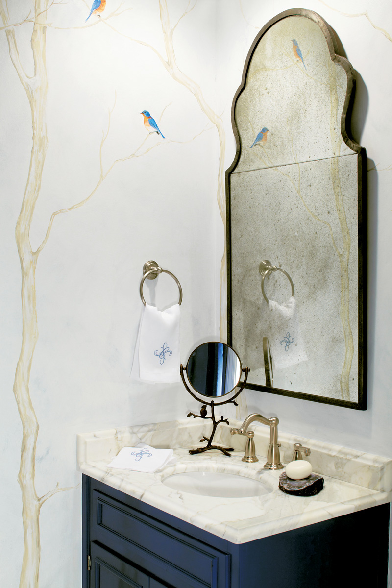
What was your inspiration? One day I was looking at images of bluebirds against a snowy winter landscape and that sparked my imagination. Connecting what we see outdoors led to creating an unexpected and elegant bath. How do you describe the color palette? The color scheme came naturally and it all revolved around the colors seen on bluebirds. As you study bluebirds, there’s much more than blue. I noticed the warm russet tones on their breasts and discovered that the Calacatta Gold marble reinforced this hue, with the golden veins mixed with gray tones against a creamy white background.
In the guest bath, designer Susan Currie chose Benjamin Moore’s Decorator’s White paint as the background for the mural.
Terrace // Shawn Miles Bailey, Home Decorators Collection
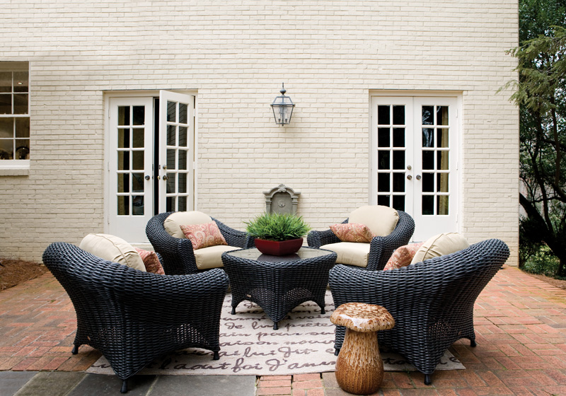
The terrace by Shawn Miles Bailey of Home Decorators Collection.
What did you want visitors to take away from your design? Exterior spaces can be as beautiful and comfortable as your interior spaces. With today’s technological breakthroughs in durable materials, the outdoor furniture and rugs of today blur the lines of indoor and outdoor pieces, so get creative!
Passageway // Dawn Trimble, White Box Interiors

Dawn Trimble’s Sir John Soane-inspired passageway.
What was your inspiration? The Soane Museum in London, England. Because my space was rooted in neoclassic design, I decided to work with the wall trim and paneling. If a room has good ‘bones’ to begin with, it helps with creating a narrative for the room. By keeping your background simple, it’s possible to unify a variety of antique items—by scale, shape, size and texture—into a holistic space.
Main Entrance Landscaping // Marcia Weber, Gardens to Love
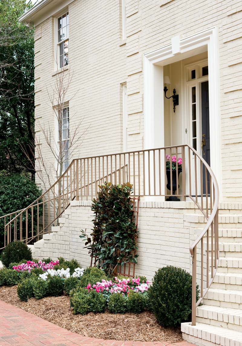
Marcia Weber’s landscaping for the home“s front entrance.
How do you approach the design of the space? Inspiration for the small parterre garden planted with cyclamen came from old garden books in our office library. We needed that bright pink color as a visual snap to a dull late-winter week. And the hot pink was used inside the house, as well.
Foyer // Robert Spiotta, Robert Spiotta Decorative Arts, Ltd.
Robert Spiotta’s foyer.
What’s your favorite thing about your space? The room’s greatest challenge is also its greatest asset: it is multivalent. It has to be experienced simultaneously on several different levels, spatially and psychologically. So, I love the artwork I chose, especially the piece you experience when you walk in the front door—the kinetic, sensual photograph on silk by Mexican teenage artist Camila Apaez Rubio.
Go to blog.cathedralantiques.org/inspiration-house/ for designer information