2012 Kitchen of the Year Winners
AHEAD OF THE CURVE
A smartly designed modern kitchen balances sleek style and a mix of materials for a visually stunning space
GRAND PRIZE WINNER
Design Galleria Kitchen & Bath Studio
Mary Kathryn Timoney
Architecture
Randall-Paulson
Architects
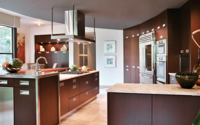
This kitchen definitely makes a statement. Did the homeowner know exactly what he wanted?
Mary Kathryn Timoney: The client, architect Alex Paulson, knew he wanted an edgy and modern space with organic elements to visually soften it. He also wanted to delineate between the kitchen and breakfast areas, and have a place to entertain, serve and set up a bar— without interfering with the main cooking and prep areas.
What was the biggest challenge?
There is a large, 13-foot rectangular island in the room that was too far from the sink to make it an efficient work area. Also, the “organic” feel doesn’t come naturally when you’re working in a very rectilinear space.
How did you solve that issue?
The view outside is pretty organic. Yes, it is so lush and green outside and Alex wanted the same feeling inside, which is why we brought in the stone wall. Plus, we used other natural materials like the marble floor and the curved black walnut top on the island. The design is super modern but the organic elements soften it.
Tell me about the curves in this kitchen.
We put in a curved, dropped ceiling to visually soften the space while creating a subtle distinction between the kitchen and breakfast areas. Curving the tall wall pulled the refrigerator and ovens closer to the island, and the flooring mirrors the curve in the ceiling and forces the island closer to the tall wall.
So the curved floor makes it a more functional kitchen?
Definitely. The island is a cooking and prep area while the sink area is a cleaning zone. Next to the sink there’s a serving area with a dish pull-out that makes it easy to go between the dishwasher and the serving area.
Why the different levels on the island?
This way we didn’t have seams in the marble from trying to cover the whole island. The raised bar at the end is a perfect bar set-up, with an ice maker and wine storage unit, and it keeps guests out of the main work zone. Plus, the black walnut eating bar floats and keeps people from having to look at dirty dishes.
Storage isn’t a problem?
Some is hidden, like a walk-in pantry to the left of the refrigerator.
There are so many different materials in the kitchen, yet it all comes together so smoothly.
Again, I didn’t just stick one stainless element in the middle of the kitchen. The bar top is stainless and the wood on the bar is framed with stainless, plus the appliances are stainless. The countertops and floor are the same marble.
Photograph courtesy of Design Galleria Kitchen & Bath Studio. KITCHEN DESIGNER Mary Kathryn Timoney, Design Galleria Kitchen & Bath Studio. 351 Peachtree Hills Ave., Suite 234, Atlanta 30305. (404) 261-0111; designgalleria.net ARCHITECT Randall-Paulson Architects BUILDER Bert Thompson Homes ALL APPLIANCES through Distinctive Appliances COOKTOP Wolf OVENS, WARMING DRAWER AND DISHWASHER Miele WOOD TOP designed by Mary Kathryn Timoney, fabricated by Craft Art STAINLESS COUNTERTOP AND ISLAND FRAME Design Galleria CABINETS Downsview Kitchens by Design Galleria
FRESH APPROACH
A team of designers employ creative configurations to give this old house’s pint-sized kitchen airy cottage appeal
WINNER
TerraCotta Properties
Architecture and Interiors
Ili Nilsson
Architecture Luly Melarti
Construction Manager
Maurie Hullender
Construction
Darren Gladieux
Construction
Daniel Huertas
What was the goal for this remodel?
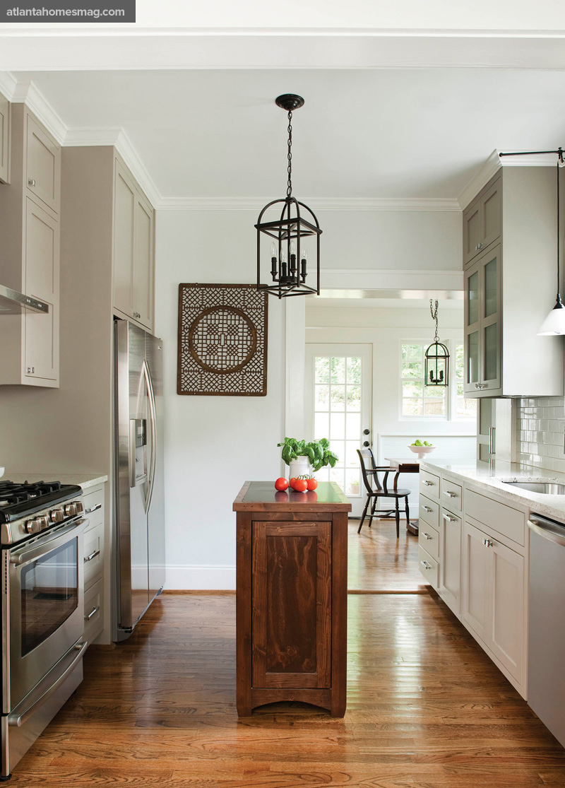
Ili Nilsson: The client, Thomas McCullough, is single and wanted something that wasn’t frilly but not overly masculine, so it wouldn’t be hard to sell later. Basically, it needed to have broad appeal. We wanted to streamline the flow of the space and increase the natural light. Also, we had to pack a lot of function into a relatively small space.
Where did you start?
The entire house was being remodeled, so our budget was limited. The first thing we did was determine what we could keep and what had to go. We wanted to save as much of the existing plumbing and electrical work as possible, but it wasn’t much. We were able to keep the “wet wall.” We moved the sink and dishwasher but the plumbing wasn’t moved. The rest had to be brought up to code. And the plumbing for the laundry and breakfast area is all new.
Did you add any space?
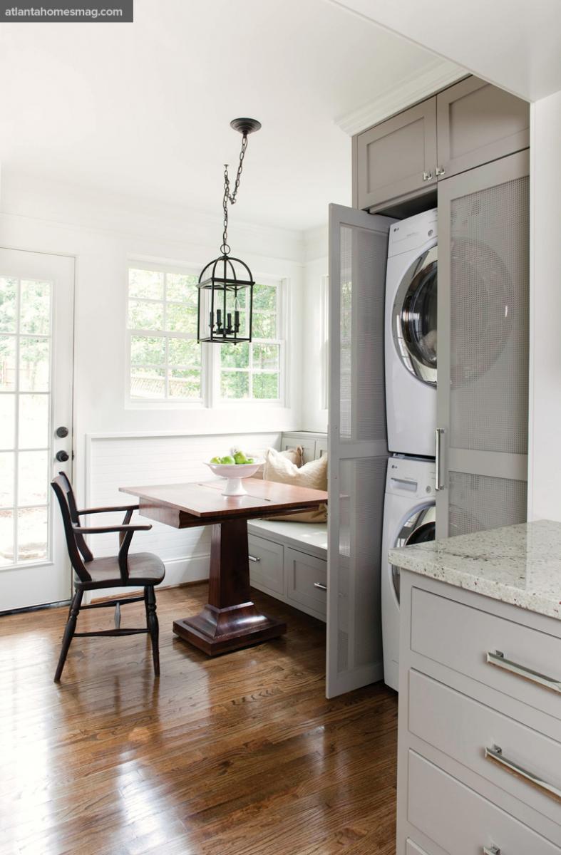
No, we took over an area that was probably a poorly enclosed outdoor space. It was in complete disrepair and the whole thing had to be gutted. That’s now the breakfast area and adjacent laundry area.
What about the layout?
The entire flow is different. There was an opening to the bedroom and hall where the refrigerator is now. It was completely unnecessary, so we closed it and enlarged the opening that had the old swinging, double doors leading from the kitchen to the dining room—you know, back when the host just came through the doors with serving platters, so no one ever saw anything messy like the actual cooking or prep work. That now opens up to the laundry and breakfast room. So the kitchen was L-shaped and now it’s one open space.
How did you make the most out of the space you were given?
We maximized the cabinetry, taking it up to the ceiling. The shelves are full extension pull-outs. The built-in bench in the breakfast area has storage on the bottom and in back; it’s 12 inches deep behind the pillows. After we draw plans, we actually give them to the client with little stickies to mark where they will put their dishes, cooking utensils, etc. This way we know there is room for everything before we ever start construction.
Love the small pantry in the wall.
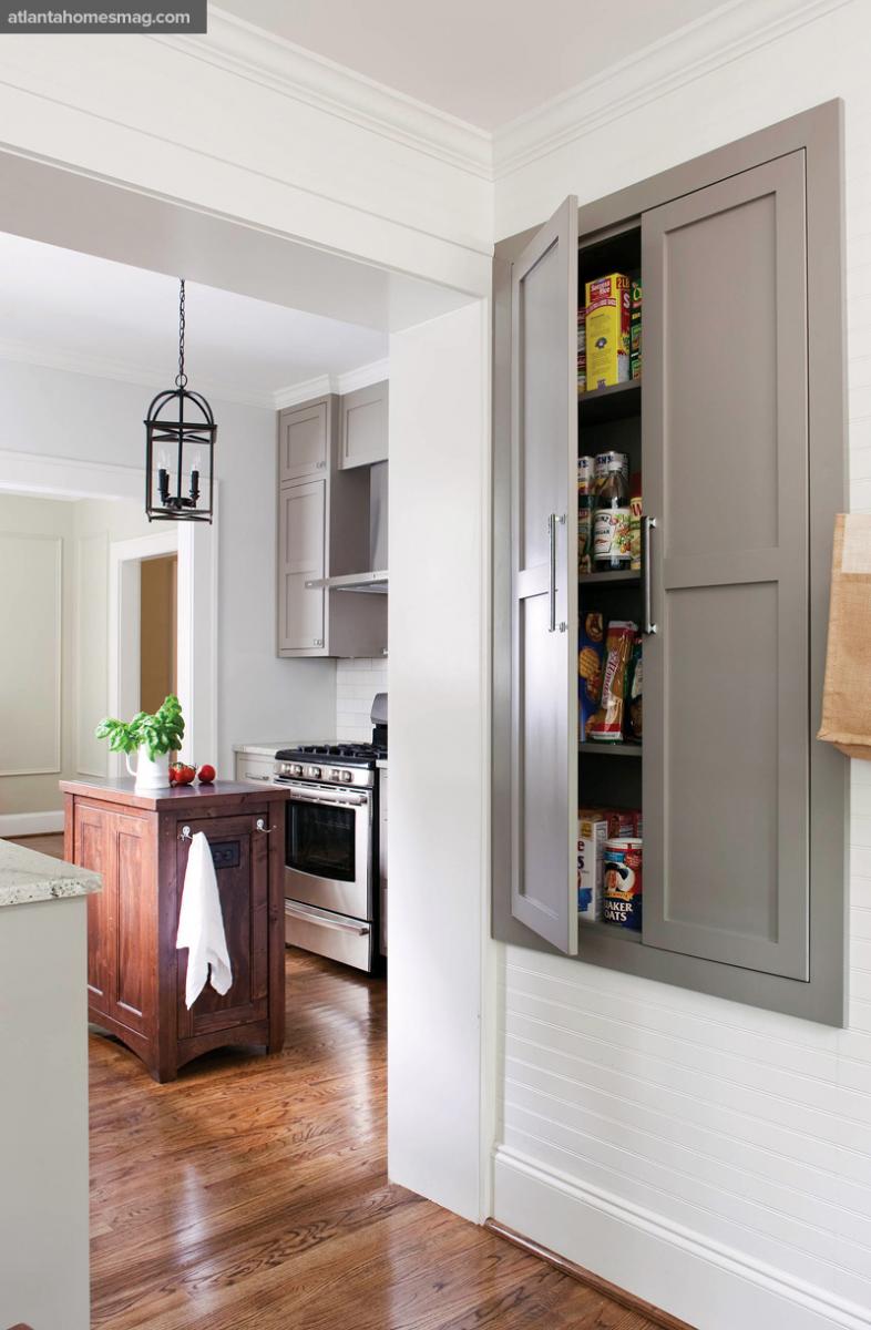
Yes, it had been a window into the bathroom, so we had a choice of closing it up or doing something with it. We decided to celebrate the fact that this was an old house. It’s very shallow, about eight inches deep inside. We also added the beadboard to give it more cottage appeal than the existing brick did.
What about the island?
It is hard-wired and holds the microwave. It’s very functional. He can get ingredients from the fridge and do prep work on the island, then move on to the stove.
Photographs courtesy of Terracotta Properties. KITCHEN DESIGNER Ili Nilsson, TerraCotta Properties. 403 West Ponce de Leon Ave., Suite 215, Decatur 30030. (404) 377-0906; terracottaproperties.com ARCHITECTURE Ili Nilsson and Luly Melarti CONSTRUCTION Maurie Hullender, Darren Gladieux, Daniel Huertas CABINETS Greenwalt & Sons COUNTERTOPS Intown Design CABINETRY COLOR Sherwin Williams Pavestone HARDWARE Restoration Hardware PULLEY SCONCE Architects & Heros COACH PEDANTS Quoziel APPLIANCES KitchenAid, Jenn-Air WALL COLOR Sherwin Williams Fluer de Sel TRIM COLOR Sherwin Williams Bright White
Personal Space
Polished stainless steel, Calacatta Gold marble and mirror panels add sparkle to the kitchen of this glamorous young professional
WINNER
Design Galleria Kitchen & Bath Studio
Robin Pittman
What was the first order of business?
Robin Pittman: To open up the space, we pulled back the existing walls between the cabinet and storage area as far as we could.
What was your biggest challenge?
The home is in a high-rise, so we were limited in our construction. Basically, we couldn’t move any existing plumbing or electrical. So we concealed the plumbing from the sink wall behind paneling, behind the base cabinets and counter cabinets.
When was the original kitchen built?
Probably when Reagan was in office. It was definitely time for an update.
What was the homeowner looking to accomplish with the new kitchen?
The homeowner is Jula Jane, a young successful businesswoman who travels a great deal for work. She wanted a kitchen where she would feel comfortable entertaining friends and clients. She also wanted it to reflect her personal style.
What’s her style?
An updated, somewhat glamorous look suits her.
How did you achieve that?
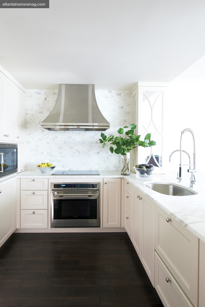
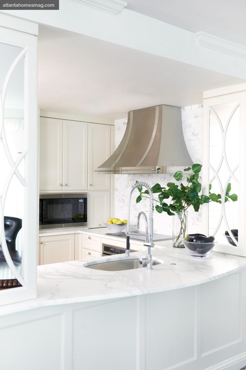
The polished stainless steel hood with its banding detail adds a little sparkle, as do the three-sided mirror panels. Materials like the Calacatta Gold marble backsplash and counter- tops have a clean feel.
What are your secrets to making a small space look open and airy?
A light color palette makes a room feel bright and open, and the tile backsplash is taken to the ceiling, which draws the eye upward so the ceiling seems higher. The three-sided mirrors on the cabinetry reflect light from the living room windows and make the space seem larger.
So the mirrors work in a couple of ways.
Yes. They helped the space look bigger, hid the plumbing and added a touch of glamour.
Where’s the all-important refrigerator?
It’s hidden behind a panel to the left of the microwave. Again, we couldn’t make any electrical changes, so it is in the same place it was before. But we put in a 27-inch Sub-Zero that’s perfect for Jane since she is single and travels a lot.
So she has plenty of storage space?
Yes, she has a ton of storage. The counter cabinetry helps by making room for the stainless hood. She uses kidney corner pull-out shelving for pantry storage and the cabinet above the microwave is storage, too.
Photographed by David Christensen. KITCHEN DESIGNER Robin Pittman, Design Galleria Kitchen & Bath Studio. 351 Peachtree Hills Ave., Suite 234, Atlanta 30305. (404) 261-0111; designgalleria.net COUNTERTOPS AND BACKSPLASH Calacatta Gold marble, fabricated/installed by Stone Professionals, supplied by Renaissance Tile SINK Elkay through Ferguson Enterprieses FAUCET Dornbracht through Ferguson FRIDGE Sub-Zero MICROWAVE, COOKTOP AND OVEN Wolf through Ferguson HOOD Vent-a-Hood DISH DRAWERS Kitchenaid CABINETRY HARDWARE Matthew Quinn Collection
CROWN JEWEL
A well-appointed penthouse kitchen sets the tone for luxurious living
WINNER
Design Galleria Kitchen & Bath Studio
Matthew Quinn
Interior Design
William Stewart Designs
Architecture
Oliver Carter
What was your goal when designing this kitchen?
Matthew Quinn: The client wanted a beautiful space that integrated into the rest of the home and was comfortable for two. You see the kitchen as soon as you step off the elevator. We wanted it to look more like a finely detailed living room.
What were some elements the client wanted to incorporate?
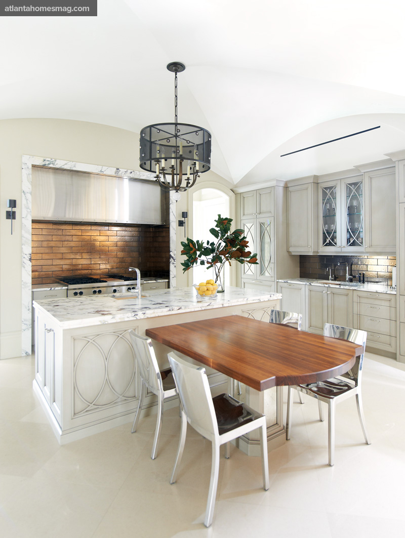
The Calacatta Viola marble countertop was the only “must have” in the space; it was the color inspiration for the entire room. The homeowners are true believers in assembling a collaborative team and taking the best from each member. The architect, Oliver Carter, designed the gorgeous groin vault ceiling. The interior designer, Bill Stewart, selected the color palette, light fixtures and decorative hardware. I was responsible for first making the space function and, second, for adding the right amount of detail to the kitchen so that it became an extension of the architecture in the rest of the home.
Was there anything from the original plan that didn’t make the final cut?
Originally, we had all agreed on veneering the entire hood wall all the way to the ceiling in marble, but once the Viola was selected we knew that was going to be too busy, so we opted for the simple frame around the hood alcove. Also, we had first specified the 48-inch Wolf range but as the space became more and more elegant we figured out how to shift the kitchen slightly to tuck the ovens behind retractable doors—next to a main structural column—while keeping the space symmetrical.
My eye goes right to the chandelier.
It’s metal and crystal, and it hangs from the center of the groin vault ceiling. The room is very symmetrical and the chandelier is the main axis.
Where are the appliances?
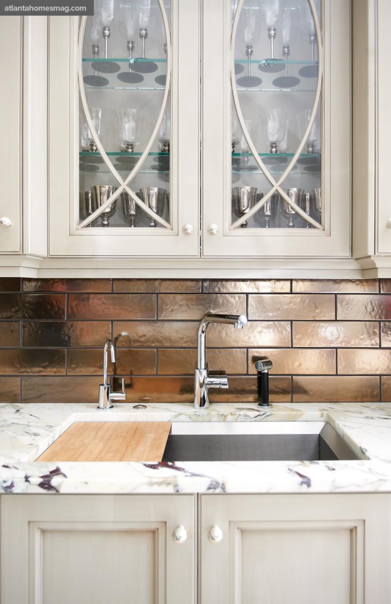
The range top and two sinks are the only visible appliances. The scrolled fretwork over mirror paneling is the dominant element in the kitchen.The paneling conceals a full-size refrigerator, freezer, appliance alcove, pull-out pantries and double wall ovens. We even hid a structural column with the panels. The same design is on the glass cabinets and the island panels.
Tell me about the fretwork design.
I have a folder of pictures on my iPhone that contains nothing but windows and doors I have seen all over the world. This pattern was from an elevator door in Milan.
Is there a danger of repeating an element too much in a room?
Absolutely. This is successful because of the gorgeous ceiling, the monochromatic limestone floor, the painted walls and the neutral palette.
What about the furniture?
The chairs are aluminum, and the table that extends out from the island is cherry. The kitchen is consistent with the rest of the home—traditional with modern elements thrown in. Details like the polished nickel hardware and the black nickel sconces (flanking the range top) add extra glitz.
Photographed by David Christensen. KITCHEN DESIGNER Matthew Quinn, Design Galleria Kitchen and Bath Studio. 351 Peachtree Hills Ave., Suite 234, Atlanta 30305. (404) 261-0111; designgalleria.net INTERIOR DESIGN Bill Stewart, William Stewart Designs ARCHITECTURE Oliver Carter, Neil/Carter LLC CONTRACTOR Berndsen Custom Homes CABINETS Downsview Kitchens by Design Galleria RANGE HOOD Design Galleria APPLIANCES through Guy Gunter & Associates OVENS, RANGETOP, WARMING DRAWER Wolf FRIDGE Sub-Zero MARBLE COUNTERTOP Calacatta Viola through Marmi Natural Stone WOOD COUNTERTOP Craft Art HARDWARE Matthew Quinn Collection SINKS Kohler FAUCETS Dornbracht through Renaissance Tile & Bath BACKSPLASH TILE Waterworks AUREOLE SCONCES by Holly Hunt through Jerry Pair & Associates CHANDELIER James Lockridge through Grizzel & Mann CHAIRS Phillippe Starck for Emeco


