All Dressed in White
Using John C. Portman Jr.’s signature paint color, “Portman White,” as their muse, seven area designers paid homage to the esteemed Atlanta architect and developer at AmericasMart’s July market with inspired vignettes. The hue—white, plus two dashes of red—is now available at Sherwin-Williams stores by request.
Striking Simplicity
Keeping Portman’s understated style in mind, Stan Topol elected to take the minimalist route, highlighting both the versatility of Portman’s trademark paint color as well as the striking simplicity of his architectural designs. Thanks to Christopher Guy wall mirrors lining the back wall, a glittering Baccarat crystal vase and a charcoal table from Veronica Flam, the vignette is as head-turning as it is dramatic.
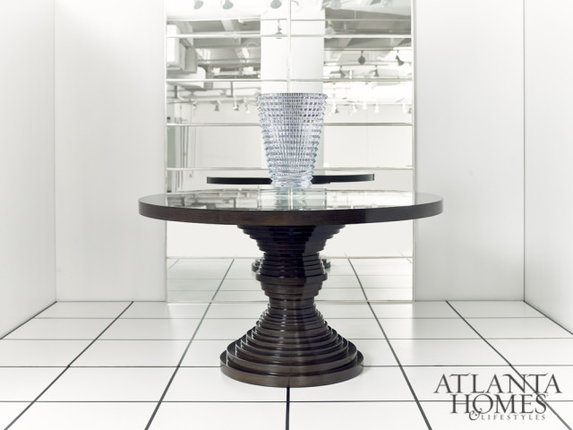
EYE VASE Baccarat through Rosse and Associates, Inc. TOUNSI MIRRORS Christopher Guy by Veronica Flam KIMBRA ROUND TABLE Rene Cazares by Veronica Flam
A Study in Style
Playing off Portman’s sweeping career, Kristin Alber for REstyleSource cultivated a functional yet creative designer workspace, outfitted in a striking combination of white and blue. A bold accent wall pops against a crisp, white bookcase from Moe’s Home Collection and chairs from LEE Industries. Eye-catching Zoe Bios artwork from Emporium Home and an “inspiration wall” of layered prints add additional bursts of color.
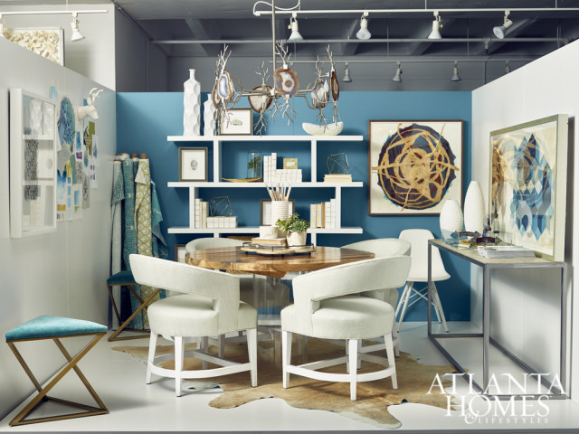
BOOKS E. Lawrence through J. Douglas Chandelier Emporium Home LUCITE TABLE AND TRAY Grace & Blake ACCESSORIES AND SCULPTURES Gold Leaf Design Group CHAIRS AND OTTOMANS Lee Industries PALM BOWL, JOSHUA TREE PLATTER AND PHOTO PALM FRAME Michael Aram WHITE SHELF Moe’s Home Collection ARTWORK Christopher Marley RUG Saddlemans SUCCULENTS Gold Eagle MINERAL BOTTLES Jamie Dietrich WHITE VASES Cyan Design BOLTS OF FABRICLacefield through J. Douglas TRAY Gabby ARTWORK Zoe Bios through WHITE CHAIR Golden Oldies CONSOLE Tritter Feefer Home Collection GEOMETRIC PRINT Wendover Art Group DECORATIVE ACCESSORIES Oly
Color Contrast
Ever the connoisseur of deftly executed flair (he considers hot pink and violet neutrals, after all), Brian Patrick Flynn held nothing back in his vibrant arrangement, layering the white backdrop with a selection of statement-making fabrics and accessories in complimentary textures, shapes and colors. Pulling these elements together is a playful painting from Leftbank Art Co., whose pops of red, blue and teal are carried throughout the scene.
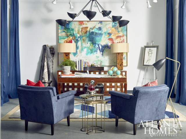
BLUE CHAIR Charles Ray & Associates GRASSHOPPER FLOOR LAMP Control Brand MARCHMAIN TABLE LAMP Currey & Company DRAPERY PANELS Emdee INTERNATIONAL SUNRISE WRITING DESK, BASKETWEAVE MEDIA CABINET, MIMI CHAIR, EMERGYWOOD CHAIR Global Views COWHIDE OTTOMAN, GLOBES, ANTLERS, NAUTICAL LIGHT Golden Oldies ANTON SIDE TABLES Interlude Home, LLC AREA RUG, LINEN PILLOWS Jaipur Rugs, Inc. FRAMED ARTWORK Leftbank Art Co. CEILING LAMP Stilnovo, LLC
Royal Splendor
When seeking inspiration for his vignette, Kerry Howard looked to a source that also inspired Portman: the Alhambra, an intricately designed palace in Granada, Spain. To that end, Howard honed in on a palette of green and gold, adding opulent details such as horseshoe arches, a gold-finished convex mirror, textured moss (a nod to the Alhambra’s luxurious gardens) and whimsical taboret poufs. An ornate chandelier from Currey & Company completed the designer’s signature aesthetic.
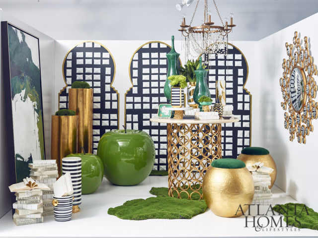
DECORATIVE TABLE Ella Home CHANDELIER Currey & Company PAINTING Design Legacy ASSORTED BOOKSE. Lawrence through J. Douglas AQUARIUS MIRROR Emporium Home GRANDE URN Global Views MOSS Gold Eagle USA DECORATIVE ACCESSORIES Waylande Gregory through Codarus TABOURET Worlds Away through J. Douglas PLANTERS fleur ami GmbH OVERSIZED APPLES Pottery Pots
Bold Minimalism
Inspired by an architect’s work table, Niki Papadopoulos of Mark Williams Design Associates focused on geometric shapes and saturated colors, adding drama with 1980s-inspired pieces such as CFC’s curvaceous, inky Bertha chair and a gold-leaf table from World’s Away. To offer subtle texture without adding too much color or detracting from the painting by Kelly O’Neal, Papadopoulos lined the walls with architectural plans.
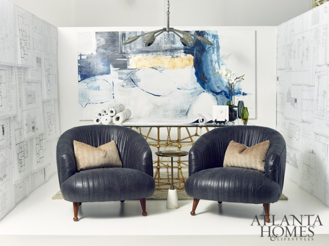
ACCENT TABLE Arteriors through J. Douglas RESILIENCE WALL ART Design Legacy RUG Jaipur Rugs Inc. CHANDELIER AND CHAIRS CFC through J. Douglas FLOWERS SIA Home Fashion TABLE Worlds Away through J. Douglas
Depth of Field
Michelle Workman began with the idea of a dining vignette, incorporating a contrasting palette of white, red and blue to create an enveloping effect and play off the warmth of Portman’s signature hue. Using a tablescape from Mottahedeh as the base for her design, Workman layered in a Chinoiserie Fromental wallpaper and patterned tablecloth, adding textured accessories such as Dogwood branches from Gold Eagle and accessories from Regina Andrew.
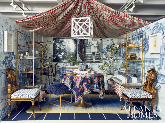
BRASS WIRE TREE BRAISED SPIKE BALL, PYTHON BOXES Regina Andrew DINNER, DESSERT, BREAD AND BUTTER PLATES, BOWLS Mottahedeh & Company TAPERED CHEST Ambella Home Collection NEFRET CHAIRS, ETAGERES Currey & Company CHIPPENDALE LANTERN Lowcountry Originals FLATWARE, WINE GLASSES, CHAMPAGNE FLUTES, BUTTERFLY PITCHER, FEATHER LIMITED EDITION SCULPTURE Michael Aram BINOCULARS Golden Oldies PILLOWS Hedgehouse through Halcyon Home Décor DOGWOOD BRANCHES Gold LAYERED RUGS Jaipur CHIPPENDALE LANTERN Lowcountry BUTTERFLY ARTWORK Pheromone by Christopher Marley DECORATIVE ACCESSORIES Design Legacy by Kelly O’Neal CHINOISERIE WALLPAPER Fromental
Carte Blanche
When scheming his fanciful Portman White homage, designer Michel Boyd pounced upon the opportunity to pack the 10-foot-by-10-foot space with Bergdorf-like theatrics. To avoid skewing overly monochromatic, Boyd employed layer upon layer of textures, including vintage doors from Aidan Gray, white coconut shells from Palacek and Mongolian fur throws from Codarus.
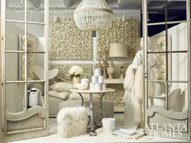
VINTAGE DOORS Aidan Gray SILK PILLOWS Bandhini Design MONGOLIAN SHEEPSKIN STOOL Moss Studio through Codarus WALL DECOR, MIRROR AND SHEEPSKIN THROW Palecek BEADED CHANDELIER Ro Sham Beaux SQUARE GLASS LAMP Barbara Cosgrove through Codarus IRON SCULPTURE Ella Home PARKER ACRYLIC CONSOLE Zentique ANTIQUE DECORATIVE ACCESSORIES & OBJECTS Gabby SECTIONAL & OTTOMAN Calvin Klein Furniture ARM AND SIDE CHAIR Golden Oldies


