Pattern Perfect
Heather Hogan Roberts infuses her family’s North Buckhead residence with large-scale luxe and natural appeal

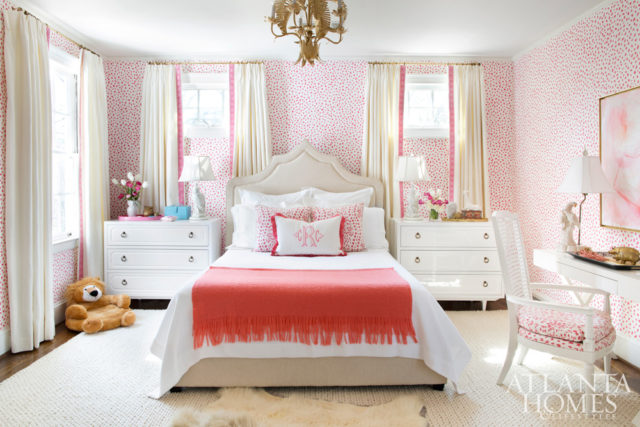
Roberts’ daughter’s bedroom is as feminine as it is youthful…and just plain fun!
For decorator Heather Hogan Roberts, creating bold color schemes is more instinctual than scientific. “I have learned over time to trust myself to let a pop of color shine versus take over the entire home,” Roberts says. And, while the circa-1941, Frazier and Bodin–designed home she shares with her family of five in North Buckhead was originally designed to be formal (think properly defined dining and living rooms), it’s Roberts’ joyfully tactile approach that keeps the spaces feeling not just fresh—but far from formal in application.
Roberts personally gravitates towards sea foam green and ethereal blues, a color thread evident throughout the home’s first floor spaces, but she maintains that because her jewel box of a residence features perfectly square rooms, each space should be free to have its own look—or the creative license to stand alone. But don’t rely on daring patterns and bold prints alone to express your personality: “I have a collection of Portieux Vallerysthal glassware that gives just the right ‘wow,’” Roberts says.
“Buy vintage glassware and accessories—all in the same color, and collect it (in high-end, non- hoarder style). Let the objects be the hero in terms of color, not the space.” —Heather Roberts
“Monogrammed hand towels and shower curtains from Gramercy home are my go-to for bringing in another pop of color.”
Color THEORY: a guide
Good color schemes always have … At least three or four colors to start. You can always edit it down.
An entry foyer must… Have an amazing Chinoiserie mirror—and framed intaglios. A brightly painted bench with custom pillows and a wool throw are also welcoming.
The ceiling is a great place to … Experiment with a high gloss or metallic finish or a fun wallpaper.
Before you paint that antique … Do your research—it could be worth a lot if left alone and just refinished.


