The Luxury of Comfort
A family home combines classic tudor charms with stylish updates and personal touches.
To make a house a home requires much more than a strong foundation and beautiful furnishings; it must be a touchstone for those who live within. But rarely does a home, no matter its presence, resonate with significance for all involved in its making. Not so with a certain English Tudor in Buckhead.
The home that Robin Loudermilk—successor to Aaron’s Inc., the windfall success of a rental business begun in 1955 by his father, Charles—shares with his wife, Frances, and their three children, encompasses just that. Since taking the reins of the company two years ago, Robin has helmed it with the same benevolent spirit as his civic-minded father, likewise serving the community through his work as chairman of the Buckhead Alliance. As a result, the Loudermilks often host charitable events. So naturally, their home needed to be well-suited for entertaining, while also laid-back and comfortable for the close-knit family.
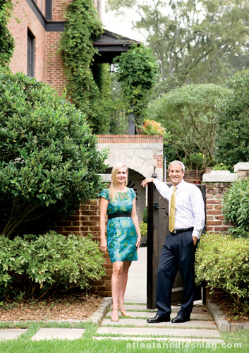
The designers who so deftly furnished it, Will Huff and Heather Dewberry, met while working for legendary designer Dan Carithers, joining forces nine years ago to form their own firm, Huff-Dewberry LLC. The Loudermilk project was their first together from the ground up yet, remarkably, eight years later, it still feels as fresh as the day it was started.
“When we signed on, we were all young, and our firm was so young,” notes Dewberry. “I think Frances wanted to work with someone who she felt had fresh ideas.” From the outset, the project was a meeting of the minds. While the construction of the new home slowly came together, most of the interior design decisions were made in a snap—including all fabric selections, which were made in just an hour and a half.
“They walked in and loved it all,” Huff recalls of the design team’s original presentations. “Considering how many rooms were in the home, it was unreal!”
For Charles Heydt, partner in the residential design firm of Pak Heydt & Associates, it was just as personal an undertaking. Like many of his projects, it was a culmination of ideas stowed away for just the right home—and just the right family. The crowning feature of the home’s facade, its alternating-wood chevron door, was an adaptation of one such idea. “I found a drawing for a similar painted-finish door in a book years ago,” the architect explains. “I always liked it and knew that, one day, it would be appropriate.”
For the granite coursework on the home’s exterior, he took a cue from a historic Tudor-style cottage he’d admired in Maine’s Acadia National Park. Regional materials, like the local granite and reddish brick the color of Georgia clay, imbue the home with a local feeling that is still quintessentially Tudor. Even the expansive leaded-glass windows have been updated with a slight pastel tint to give the interiors a soft glow.
“We’re bringing modern sensibilities into play,” Heydt explains. “We’re thinking about the family and how they like to live, as well as their modern desire for light—something that wasn’t common in Tudor structures when leaded glass for windows was more expensive.”
Huff and Dewberry added lightness to the project with equal fervor. “The Loudermilks are very subtle people,” notes Dewberry. “They didn’t want a whole lot of color, but we still wanted to make it bright and interesting.” In concert with the architect, they selected pale, rugged stones for the entryway floor to quiet the scheme, while a border of warm wood grounds the space and mirrors the beauty of the nearby coffered ceiling panels. Neutral fabrics also keep things light, while plaster walls with a hand-waxed finish impart a luminous glow.
Since the original installation, the designers have layered the look with even more personal touches—including exquisite collections of porcelain and drabware plus a pair of painted demilune commodes commissioned following a family trip to Italy that incorporate photographs taken throughout their travels.
For the Loudermilks, the well-scaled rooms and aptly chosen antiques create an atmosphere that not only feels lived in—it is. But the true mark of this home’s success is the feeling the designers get each time they return with another armload of treasures.
“When I walk back into this house, I’m amazed that it still feels so fresh, knowing that a good majority of it was completed so long ago,” Dewberry says. “Hopefully, it speaks to the timelessness of what we do. Will and I work in a lot of different styles, and a lot of different colors, but I hope that what we do is timeless.”
Floral design by Mark & Scott


