Guest Blogger: Design Galleria Kitchen & Bath Studio, Part II
Editor’s note: To kick off showhouse season, we’ve asked Design Galleria Kitchen and Bath Studio for a sneak peek into the firm’s design process as it prepares for the opening of the 43rd annual Decorators’ Show House & Gardens on April 26.
The firm’s task: To update not one, but three spaces in the historic Atlanta mansion, built in 1926 with a prominent location on West Paces Ferry. With just six weeks until the Show House’s official opening, Design Galleria takes over AH&L’s blog to chronicle their adventures in remodeling.
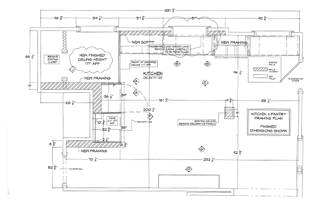
One Monday morning a few months ago, the drawings for the field-measured “as built” kitchen floor plan were placed in front of each Design Galleria team member. We were asked to look them over and bring our ideas to a meeting the following week.
I should mention that this was no ordinary space. At first glance, no architectural elements related to anything else. The windows and their placement as well as the “wall planes” they resided in made it almost impossible to find any grounding axis or centerlines. The end wall was bumped several feet forward in the room and created a sort of narrow dead space that was difficult to bring into the kitchen in any way that made sense. Additionally, there was a post in the middle of the room that was clearly structural and could not be moved.
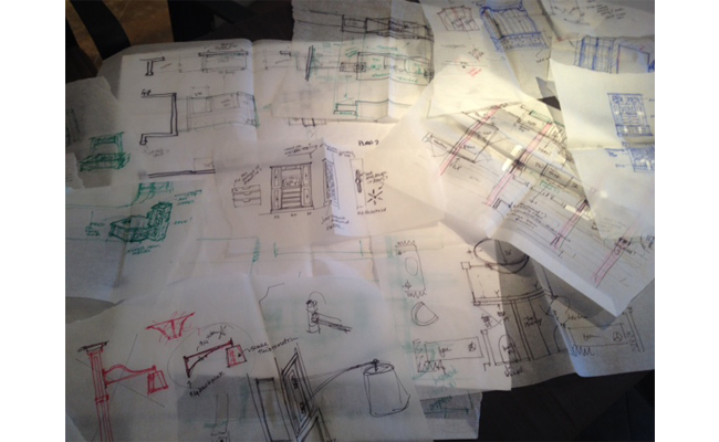
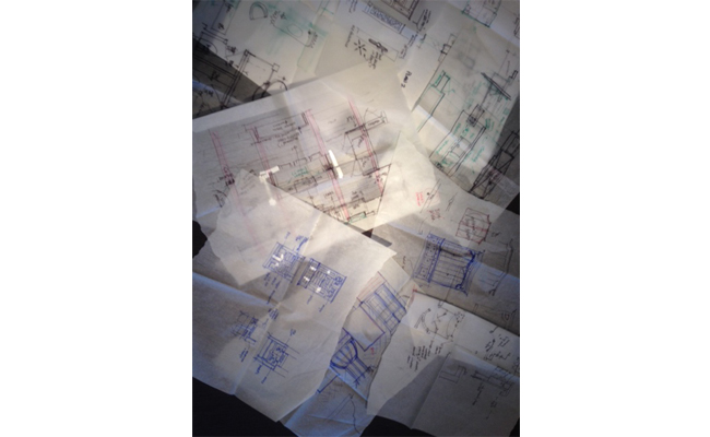
What followed was pure fun. There were so many great ideas flowing from our creative and collective streams of consciousness. On our conference table at that following meeting were dozens of loose tissue sketches and a handful of further developed plans showing multiple and very different solutions for the exact same space! Each designer and their ideas presented their own logic, vision and valid resolutions to the challenges that this old historic home presented. The creativity of the Design Galleria group never ceases to amaze me; the design solutions were nothing short of inspired! In the end, our final design and layout ended up being a selection of the best parts of several plans. It was indeed a community effort among the DG Design team.
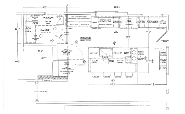
To make the end wall work for the plan, we decided to make that our “tall wall” with an integrated SubZero refrigerator and a completely finished breakfast bar. The features of that wall now center on the long axis of the room aligning with the island and lighting.
We closed off the narrow end space with a hidden pantry door that opens into a functional and well-lit pantry, thanks to the last stray window that now seems to have a purpose and increased importance in its new space.
By separating the last window and the newly gained pantry from the rest of the kitchen, we now had the opportunity to balance out the other windows and create a centerline that brings your eye and your attention to a beautiful custom hood and the gorgeous CornuFe 110 range by La Cornue. The range and hood align with the fixed post in the island creating yet another axis that helps lead the viewer through focal points into a logical layout that feels grounded and balanced. The central window on that wall is now centered on the main sink of the island.
Additionally, our permanent post that started out as a nuisance has now become an interesting and necessary element in our design. It now has an aesthetic purpose as well as a functional one as it balances and supports the base plate and cantilevered arm of a gorgeous custom light fixture. The fixture was precisely designed to span the island and to hang over the sink, connecting the imaginary dots from centerline to centerline in a dramatic and unexpected way.
Lastly, beyond restructuring the kitchen, we also added a customized coffee bar at the opposite end of the room, and a fun dog feeding station too! Ample storage and a gorgeous dish pantry complete the space.
Next week: Join Matthew Quinn to see the process and progress on the Master Suite Layout.
Written by Laurie Lehrich


