On Tour: Judy Bentley’s Timeless Townhome
One of Atlanta’s favorite wintertime traditions, The Cathedral Antiques Show, and Atlanta Homes & Lifestyles couldn’t be more thrilled to be a presenting sponsor. We hope to see you there this week, whether perusing the nine room-like, antiques-filled vignettes on Inspiration Avenue or on the Tour of Homes on February 8, which offers an exclusive peek into five of the city’s most beautiful and masterfully designed homes, including the Calhoun Estate on Pinestream. (Find full details on the Cathedral Antiques Show in our February issue).
To gear up for the show, we sat down with interior designer Judy Bentley, who has opened the doors of her stunning townhouse for this year’s Tour of Homes and asked her 7 questions about her home and design philosophy. Built in 2006 by the Bentley Group Ltd, the space blends timeless architecture with Bentley’s classic-yet-fresh design sensibilities.
AH&L: You’ve been involved with the Cathedral Antiques Show for years, but this is your first time participating in the Tour of Homes.
Judy Bentley: I’m honored to open my home for the tour. I know the Tour of Homes is a big drawing point for the show, and I’m just honored to be asked and be a part of it. I think the nice thing about the Antiques Show is that it’s not just antique furniture; they incorporate antique paintings, silver linens, it’s not just one thing. When you think about the Cathedral Antiques Show, we think about things from the past.
Like much of your design work, your own home is traditional with a bit of a twist. What was your thought process when designing the space?
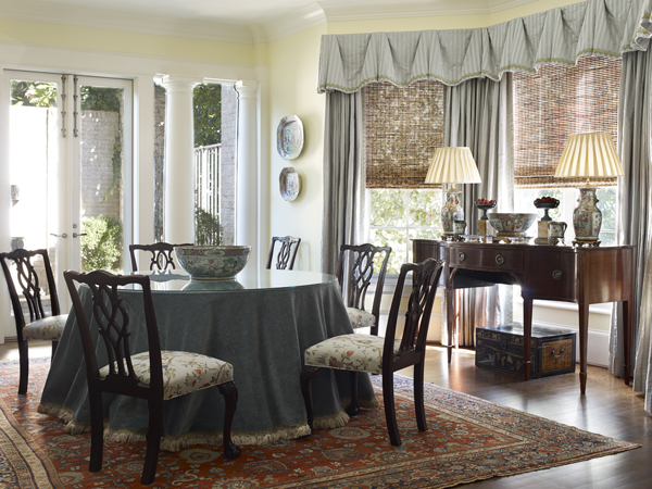
My home is classical, but I like to throw a dose of fun into my interior design work. I think my home is pretty architecturally—you could take everything out of it and it would still be a pretty home—but it reflects my taste in what I want to live with. I think of myself as being a fun person, and that’s how I like to decorate, too. I like to have a great scheme, but I like to throw in a little fun into the job, and I do that with my other design projects as well. You don’t want to get too serious. Life is a great ride, so why not enjoy it?
What design details did you add to strike that balance between serious and fun?
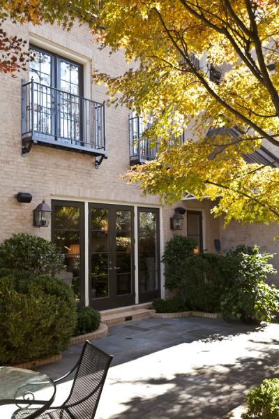
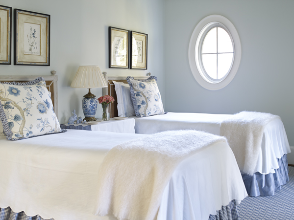
I think I’ve made it inviting and fun with the fabrics I’ve introduced. We wanted people to be comfortable—we didn’t want people to be afraid to sit on anything. We wanted it to work for our lifestyle because we entertained a lot. The outside terrace especially catered to that because we could open the French doors inside to the terrace. It was the extension of another room for us. I also have a lot of collections of items. I’ve collected blue-and-white porcelains over the years, and I have a great martini-shaker collection in my home.
What’s the most-used room in your home?
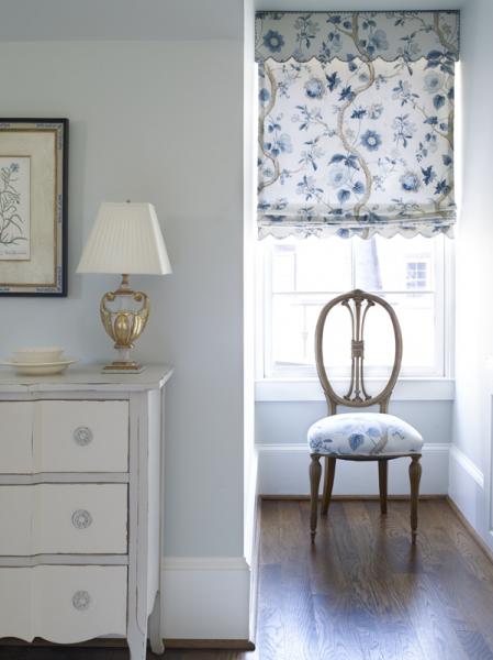
I think it’s probably my great room, which I love. It’s all done in blue and white, and anyone who knows me knows I’m attracted to blue and white. It’s open to the back terrace, and when the French doors are open, it’s just the extension of a huge room. I love living with blue and white. It’s calming and I just love the combination.
Do you have a specifc strategy when incorporating antiques into a space?
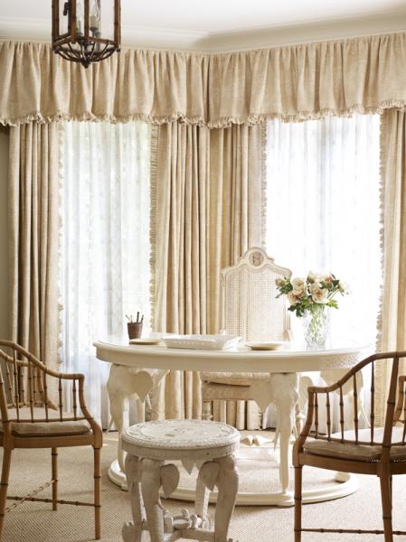
You collect antiques throughout your life, and it’s nice if you can have one spectacular old piece in a room because it draws presence and gives the room weight. It adds warmth to the room. I think it provides a great footwork for the room to work around. I might add in something with an Asian flair to it, because I also gravitate towards oriental furnishings and I love to have a little taste of that in the rooms, too. And that can be done with fabrics also.
Tell us about some of your favorite fabrics.
I love all the showrooms at ADAC, and I love dealing with all the people there. I tried to represent a little bit of everybody in my own home, but I would say that most of the fabrics in my house I chose because of color and pattern. It just so happened that I think we have more Scalamandre than anything else in the house, but we have some other lovely fabrics, too. I have some Robert Kime on two chairs in the living room and I have some Fortuny on some living room chairs as well. I have a lot of Brunschwig & Fils, and I used a lot ofCowtan & Tout and Schumacher in the bedrooms.
You’re a pro at mixing color, pattern and texture. Do you have any tips?
Don’t get carried away with it. I think you need to realize when enough is enough. I would say that I’m more classical and then I might throw in one does of fun. I love to throw in an animal print. I’ll do that through pillows or tape trim or something. I think those lift a room and keep it from being so serious. Like I tell my clients, you have to live with it everyday. It should make you happy.
Photography: Emily Followill


