The Nest: 93 Days Remaining
Meet Meg: co-owner of Huff Harrington Home and Huff Harrington Fine Art. Certified project junkie and lover of fine furnishings and décor (especially the happy marriage between crunchy antiques and modern art). Loves all the Frenchy stuff—as well as food, wine, books, fireplaces and long quiet afternoons by the pool. She’s married to Scott and has two daughters, Molly and Lily.
Days Remaining: 93
Less stuff, less fuss
For months now, my head’s been spinning with the zillions of decisions that I know are part and parcel of a renovation. Luckily, I’ve done this once before but it’s funny how I’m a little looser about everything and more open to options and alternatives. My new mantra is: less stuff and less fuss. Best of all, I’m happily putting my 100 percent of my trust in the wonderful and wise pros we’ve asked to come on board (Linda McArthur, architect and Michael Ladisic, builder extraordinaire.)
Plumbing fixtures are the first big decision on the board, so I pay a visit to nice Jennifer at Fergusons. I’ve already got a pretty good idea of what I want and Jennifer kindly tells me that this little project wins the race for the fastest consult ever. It’s easy because I’m pulling from past experience.
Go for the high and the low
Since we’re channeling the charming and chic cottage vibe, I’m going with classic plumbing fixtures in a polished nickel finish, which I adore for its warm platinum patina. I also love all things Rohl so I’ve turned to their Country Kitchen and Bath line to cover my see-and-be-seen spots.
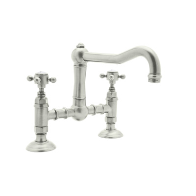
I’m thinking about using this Rohl faucet for the kitchen. (Levers or five-spoke handle?)
For some of the less-used spaces, I have found some great options at Home Depot and ordered them online which has saved me time and money. Hooray! 
The Lyndhurst from Glacier Bay (picked up efficiently and quickly on-line at Home Depot.) Perfect for the girls’ bathrooms.
Scott doesn’t have a lot of wishes but has requested a Speakman showerhead and I think have found one that cleverly disguised in an exterior that looks great with the Rohl bathroom faucets.
Think Texture…
My Pinterest boards are brimming with design inspiration for our little Nest, and Linda and Michael are on board with all the ideas. We’re going to add some textural interest to the main living areas with shiplap (horizontal planking) that will be painted a nice, crisp white.
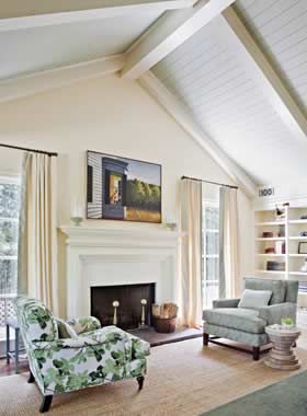
Inspiration for the vaulted ceiling and boxed beams.
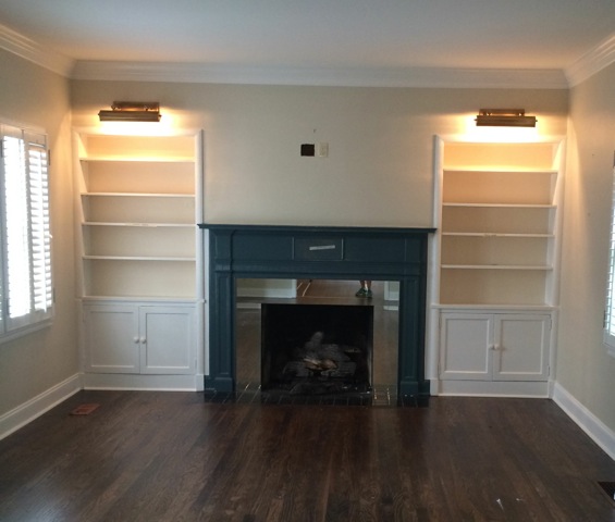
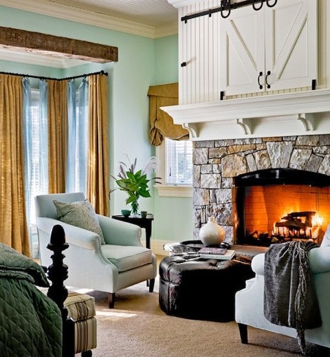
The vaulted ceiling in the sweet (but tiny) family room will have simple boxed beams, also painted white. The bright blue mantel will get a new life with paint and we’re keeping the adjacent built-ins for some of my books and some knick-knacks.
Here’s the mantel…before.
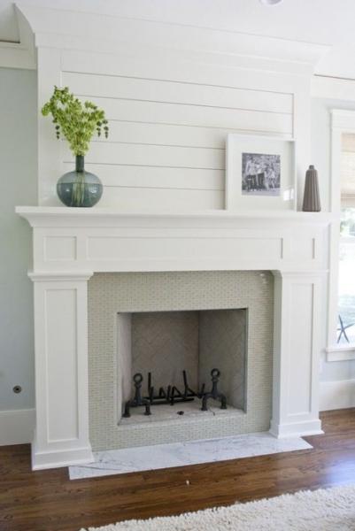
The after: I’m visualizing this for the mantel in our cute little family room
Uh oh. A little hiccup…
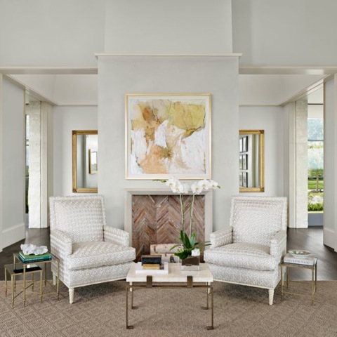
Luckily, the Nest’s family room has a lovely little fireplace and mantel surrounded by built-ins…But uh oh: right off the bat, we quickly find ourselves with the dreaded where-to-put-the-TV dilemma. As a fine art gallery owner, I’ve always felt that a mantel was a great opportunity for a beautiful painting and I’ve stuck to my guns…until now.
I really wanted to hang a gorgeous abstract over the mantel…
This is what I had in mind…before the mantel uh-oh.
Our first option (reconfiguring the existing surrounding bookshelves to accommodate a TV) is quickly voted down as a budget- and schedule-breaker when we realize it involves ripping out the entire brick and plaster wall. We agonize over this until one day my sweet and patient husband had the courage to actually suggest putting it where it probably needs to go: over the mantel.
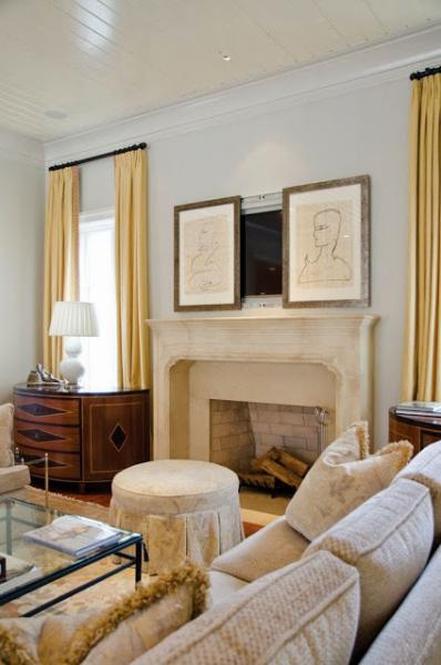
I could live with this….
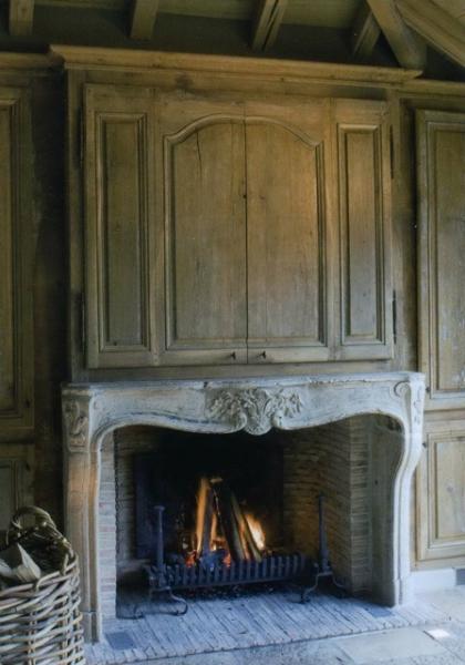
And this is so gorgeous if we were going Frenchy…
And you can have it both ways: art covers the TV.
We finally came to grips with it but we’ve got some non-negotiables: Michael’s clever trim people are going to have to design a great looking disguise for it so we can shutter it away when we’re not using it. And phew, I’ve got plenty more wall space in that room for my beloved paintings. (Any ideas about the TV over the mantel? I’m all ears….)
Do double-duty
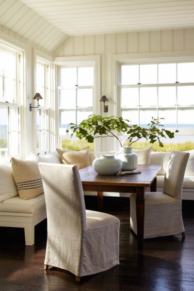
We have a multi-purpose room that will serve as our dining room/library and piano room (the pretty piano that we all love but no-one can really play.) This space is flooded with light and has a full wall of windows that overlook the back lawn.
I’m hoping our little dining space will end up like this.
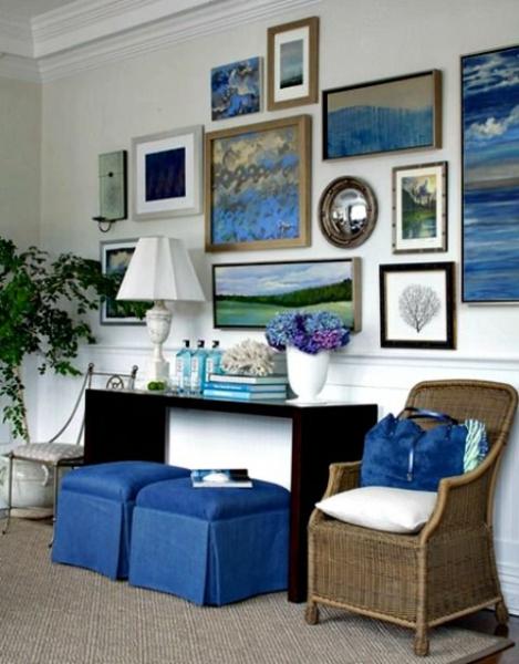
Bonus: A big long wall that will be perfect for the gallery collection I’ve always wanted to hang.
Inspiration for my gallery wall.
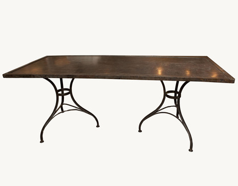
The little crown jewel will be the gorgeous Swedish crystal chandelier my mother gave me. And bye-bye to the dining table that seats 14 – you’re going into storage for a while. Instead, our dining table will be the pretty French iron-based and wood table that we used as a kitchen table in the old house. (I’m not sure what we’ll do about seating 11 at Thanksgiving…)
A perfectly Parisian little table will suit weeknight dinners to a tee.
I’m finding that the Nest is the perfect culmination of where my life is: I want it pretty, easy and clutter-free. I want a few lovely pieces – and nothing that can’t do double-duty. I can’t wait for this carefree lifestyle where everything has a place and a place for everything.
What’s next? Stay tuned for updates for the new kitchen and all its trimmings.
For inspiration and updates on Meg’s renovation, follow her Atlanta Homes & Lifestyles Pinterest board.


