Kitchens!

For the past 20 years, Atlanta Homes & Lifestyles (and, in its earlier incarnation, Southern Homes) has chronicled the latest trends in kitchen design. Our 2009 Kitchen of the Year contest winners show us—and our panel of expert judges—not only where we’ve been, but where we are going. Three of this year’s winners exhibit an exuberance for historical precedence, while modern and classic intertwine in the abounding innovations of many. Pops of color, unique hardware and beautiful materials impart a flair that’s sure to inspire. Whatever your design philosophy, our 2009 winners demonstrate a deft way to mix it all together with ease. In Atlanta, it’s about combining the best of both worlds.
GRAND PRIZE WINNER
Meticulous Masterwork
Historical correctness, carefully executed shadow lines and extraordinary details make this space an immaculate masterpiece of kitchen artistry
Photographed by David Christensen
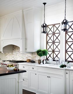
This winning kitchen renovation, which transformed a 1920’s Morningside duplex into a large bungalow-style home, is one of Neely Design Associates’ all-time favorite projects. Part of the reason, says principal Frank Neely, was because of the continuous dialogue between the designers and homeowners, which allowed them to bounce ideas off of one another and edit effectively—the crux of their design theory. “We like to keep the ego out of it…so we end up with great results that work for everyone,” Neely explains. “That said, the clients [Stephanie and Chris Marinac] were just phenomenal. Stephanie was so energetic and excited. It’s always fun to work with a client who’s involved with what’s happening.”
LAYOUT
The kitchen is very much the hub of this house—leading off the dining room, breakfast room, living room, mudroom and screened porch—and is accessible by several entryways, including a secondary entrance just off the driveway. A roll-up sash door that opens to the porch instantly transforms perimeter counter space into a buffet for outdoor entertaining.
LIGHTING
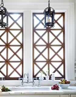
Above the window, Old World-style hanging lanterns suit the setting, because a wood ceiling—more so than plaster or Sheetrock—offers the heft needed to hold up to heavy light fixtures. The ceiling’s detailed paneling also allows standard white can lights to virtually disappear into the woodwork.
Architecturally, the V-groove wood paneling on the ceiling is one of the strongest elements of the kitchen. Its lines run vertically across the room and into the breakfast area, which is framed by a grid of beams to demarcate the lines and make the space more intimate. Strong shadow lines make the monochromatic look more interesting, while custom cabinetry meets at the ceiling for a monolithic look that makes the room’s proportions soar. Meanwhile, the sink and windows pull their cues from the Arts and Crafts cottage style, but the defining feature—an authentically mullioned window—creates both privacy between the closely neighboring property and makes the view more visually appealing.Neely’s team gladly dispatched Stephanie—with the help of designer Douglas Hilton of C. Weaks Interiors—to find decorative items that suited her tastes, from plumbing fixtures to hardware to a double range oven that frees up counter space.
HOOD
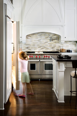
Neely and associate Christian Reed built an architectural shroud around a Vent-A-Hood liner and fan to establish a strong focal point in the kitchen. Playing up the shadow lines already in place, it also reflects the firm’s reputation for historical correctness. “This is one of our favorite walls we’ve ever built,” says Neely. “The hood and window take on an almost Gothic appearance beside one another, but they balance each other out.”
BACKSPLASH
 “Stephanie absolutely loves vibrant color,” says Neely. “The color palette throughout the house is extraordinary. We didn’t want to do a brightly colored kitchen, though. We wanted to keep the idea of the bright and white playing off of natural light and shadow lines. The pencil subway tile on the backsplash was quintessential Stephanie. We loved how it brought unexpected color and texture to the room.
RESOURCES
ACCESSORIES Lush Life CUSTOM CABINETRY Pricinsky Custom Incorporated HOOD Vent-A-Hood RANGE Wolf REFRIGERATOR GE Monogram® MICROWAVE DRAWER Sharp HAMMERED COPPER SINK Van Dyke’s Restorers FAUCET Rohl through Renaissance Tile & Bath HARDWARE Architectural Accents BARSTOOLS “Martini” by PierceMartin BACKSPLASH TILE Trikeenan Tileworks through Renaissance Tile & Bath ANTIQUE HANGING LANTERNS C. Weaks Interiors
C. Weaks Interiors, Atlanta
INTERIOR DESIGN
DESIGN DETAILS
RESIDENTIAL DESIGN
Frank Neely
Neely Design Associates, Atlanta
(404) 817-0807
neelydesign.com
(404) 233-6040
cweaksint.com
CONTRACTOR
Matt Skubic
Live Oak Construction Group, LLC, Atlanta
(404) 512-9513
liveoakgroupllc.com
KITCHEN OF THE YEAR WINNER
Midtown Modern
A couple of city dwellers take their mid-rise condominium to new heights with white lacquer cabinetry, sustainable wood floors and a shot of vibrant green
Photographed by: David Christensen
ISLAND
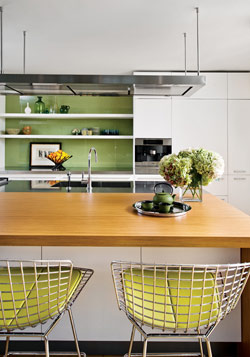
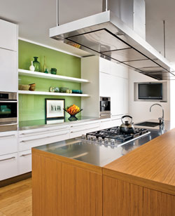
The island top was a compromise for the couple, which is one part gourmand and one part design loyalist, but they met in the middle on divergent materials. A stainless-steel workspace joins seamlessly with ovangkol wood, which adds warmth to the surface where meals are eaten.
STOOLS
A row of five classic Knoll Bertoia stools boosts the kitchen’s high modern look; a punch of green in the seat cushions carries the color story over from the display wall and throughout the space with simplicity
COOKSPACE
At its core, this is a cook’s kitchen, so the homeowners appreciated the European-style arrangement of cooktop and sink on the same surface, with easy maneuverability between them. “In American kitchens, the cooktop and sink are usually placed on opposite walls, but for somebody that really cooks, especially in the European way, he knows that it’s really helpful to have a sink and cooktop separated by only a small prep space,” says Otwell. “That’s efficiency.”
HOOD
An ingenious modern floating hood—one of the showroom’s top-selling models—is suspended higher than the field of vision to allow unobstructed views through the condominium’s many windows. Spanning the island’s length, it also provides total surface illumination with built-in lights and an efficient exhaust system that can be redirected easily if a wok or electric burner is added to the cook surface.
STORAGE
Setting the backdrop for the whole room, a wall of white lacquer cabinetry fully conceals integrated appliances in true Poliform tradition. The back-painted green glass display area was a bit of a compromise, as Otwell typically shies away from clutter. In this case, the clean, pared-down look and citrus-y shade really works.
HARDWARE
“Long, skinny Poliform standard Riga drawer handles add to the room’s horizontality,” notes Otwell. “They are very minimalist, which does not disrupt the clean lines running through the room.”
The owners of this midtown kitchen had long admired Poliform products, and the work of Poliform and SWITCH, before finally getting the opportunity to bring the company’s modern designs to a home of their own. Thankfully, a recent move to a new mid-rise condominium presented the perfect opportunity to fashion a space that was conducive to their gracious lifestyles. SWITCH Inc. co-owner and designer Roy Otwell, who works frequently out of New York, signed on as designer, working closely with the couple’s architect, Mark Williams. Because the architect also owns a unit in the building, he knew its bones well, so his perspective was instrumental in major design decisions—from the understated style of the beverage center at the home’s entrance to the unexpected combination of bamboo floors with a half ovangkol wood island top. The finished product is both architecturally precise and high on style, offering a crisp, tailored, modern and vibrant look that’s a perfect fit.
A great advantage to any convivial atmosphere, two terraces cradle this light-filled kitchen, opening up the views and adding additional space for party guests to spill outdoors. The orientation of the cooktop, especially, was designed with such occasions in mind, allowing the homeowners to engage guests easily throughout food preparation. “I particularly enjoy working with clients who actually use their kitchens,” notes Otwell. “The husband is quite the cook, and both love to entertain around their kitchen. It’s really a meeting place, where cooking, entertaining and drinking wine can all happen at once.”
RESOURCES
CABINETRY Poliform Varenna HOOD Poliform Varenna Piatta COOKTOP Miele OVEN Miele MICROWAVE/CONVECTION OVEN Miele REFRIGERATOR/FREEZER Sub-Zero REFRIGERATOR AND FREEZER DRAWERS Sub-Zero DISHWASHER Miele Excella WINE COOLER Sub-Zero PLATE WARMER Miele COFFEE SYSTEM Miele COUNTERTOPS Poliform Varenna FAUCET Dornbracht Tara Classic HARDWARE Poliform Varenna Riga handles BACKSPLASH TILE U.S. Color Glass. All resources available through SWITCH Kitchens Baths Interiors.
DESIGN DETAILS
KITCHEN DESIGNER
Roy Otwell
SWITCH Kitchens Baths Interiors, Atlanta
(404) 605-0196
switchkbi.com
PROJECT DESIGNER
Mark Williams
Mark Williams Design Associates, Atlanta
(678) 539-6886
markwilliams-design.com
CONTRACTOR
Brad Cruickshank
Cruickshank Inc., Atlanta
(404) 235-0988
cruickshankremodeling.com
KITCHEN OF THE YEAR WINNER
Savvy & Stylish
A fun and friendly kitchen wins over its new owners with practical, statement-making designs, innovative materials and alluring retro-blue cabinetry
Photographed by Amy Herr
APPLIANCES
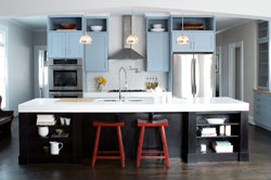
The designers chose very simple appliances so that they would not distract from the kitchen’s primary features. Most of the appliances are integrated by means of custom cabinetry. The stainless steel refrigerator, which belongs to the new owners, was added after the house was purchased.
ACCENTS
“We love the idea of an incorporated butcher block,” says Nilsson. “It emphasizes function and adds warmth to the oversize island top.”
WINE CELLAR
A built-in wine storage room backs up to the pantry and features a glass door and dimmable lighting to showcase prized bottles. “Our clients keep requesting these; they prefer a walk-in cellar over a refrigerator unit,” says Nilsson.
Ili Nilsson and Luly Melarti, the talent behind three-year-old Decatur-based architecture firm Terracotta Properties, describe their unique brand of design as a fusion of traditional “with a modern spin.” No matter how traditional the local leanings on design may be, they find a way to infuse unexpected details into homes that skew toward a younger, even non-native clientele (out-of-staters, urbanites and, frequently, European transplants). The kitchen of this particular Decatur house, now home to a young professional couple, capitalizes on black and white, with the addition of retro-blue cabinetry inspired by the fallaway lot’s ever-present blue-sky views. “The color gave speculative buyers something memorable to latch on to,” explains Nilsson. The addition of red accent stools, trays and cook pots instantly sharpens the look without a big commitment.
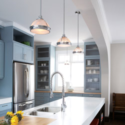
The kitchen’s open, loft-like design doesn’t block off corners or create unnecessary hallways, either. “Since it’s galley-style, it’s very much like a hallway itself…but a large one,” says Nilsson. A stylized ogee arch frames the room and establishes a separation between the living spaces while mirroring a similar architectural feature on the home’s facade. Most of the team’s projects incorporate unique architectural elements like these, which are inspired by the personality of Decatur’s Arts and Crafts neighborhoods. Still, this kitchen’s single-most defining feature is the 4-inch-thick slab of white DuPont Corian on the island countertop. A synthetic material, it is re-imagined here as a focal point, representing only one example of the innovative applications Nilsson and Melarti employ with everyday materials. “We are always pushing our creative buttons,” says Melarti. “We are looking at materials and constantly asking ourselves how to make them new, stylish and different.
 BACKSPLASH
Innovative uses of standard materials called for a lot of creativity. One example is the use of mini hexagonal floor tiles on the stove backsplash. As brilliant white as the countertops themselves, their textural pattern helps break up the monochromatic look.
HARDWARE
Capitalizing on the room’s rectilinear details, elongated satin-finish drawer pulls complete the look and enhance its vintage flair.

CABINETS
Custom-made, full-extend drawers and shelves increase the efficiency of every cabinet, meaning fewer units and more window space. The shelves of the butler’s pantry (on the far right wall) are 20 inches deep to accommodate oversize platters. A mere quarter inch of space between cabinet doors and drawers pushes the limits of classic Shaker style, while custom moldings extend the towers and add height to the room. “We always take cabinets all the way to the ceiling,” says Melarti. “Once they’re there, they work well as display cases, because the height can make them difficult to reach for everyday storage.”
LIGHTING
Utilitarian pendants from Restoration Hardware help define the monolithic island top and spotlight the window nook beyond.
FAUCET
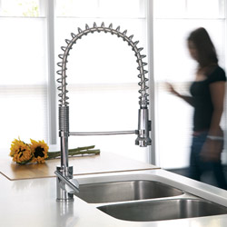
The contemporary Danze faucet makes food preparation and cleaning a breeze. The flexible design also holds up to the character of the room.
RESOURCES
CUSTOM CABINETRY Greenwalt & Sons CABINET DOOR GLASS INSERTS St. Ives Glass HOOD Rangemaster COOKTOP Jenn-Air DOUBLE OVEN Jenn-Air REFRIGERATOR GE Profile DISHWASHER Jenn-Air COUNTERTOPS Honed finish DuPont Corian in Glacier White, custom designed by Michelle Swindle, Intown Design Inc. FAUCET AND POT FILLER Danze HARDWARE Metric through Ikea BUTCHER’S BLOCK Greenwalt & Sons BACKSPLASH TILE Zumpanos PENDANT LIGHTS Clemson Collection through Restoration Hardware
DESIGN DETAILS
INTERIOR DESIGN/ARCHITECTURE/BUILD
Terracotta Properties, Decatur
(404) 310-8189
terracottaprop.com
KITCHEN OF THE YEAR WINNER
Artfully Executed
An overhauled renovation transforms a cramped bungalow into a custom-crafted home replete with sleek surfaces and charming Arts and Crafts details
Photographed by David Christensen
BACKSPLASH
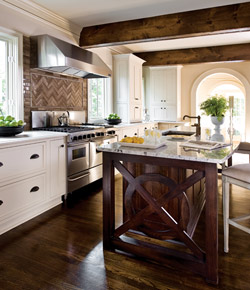
The herringbone tile backsplash was formed from crackled mocha-colored tiles and chocolate grout. “It’s a subtle feature, but it has a rich texture to it, and a classic feel,” says Parker.
COUNTERTOPS
The perimeter countertops are made from a durable man-made quartz, which works wonderfully for everyday use, Parker explains. “We loved it so much that we used the same quartz for very small mosaics in an upstairs bathroom.”
CABINETRY
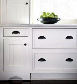
“The kitchen was very limited as far as upper cabinets, so we made them full units like counter cabinets and installed the appliances on the bottom level,” says Parker. “Each tower has its own garage for appliances like the microwave, toaster, bagel machine and cappuccino maker, with an electrical outlet for each.” Additionally, wider than usual beadboards give cabinet insets an updated Arts and Crafts look.
HARDWARE
“French hardware is something you wouldn’t ever think to add to bungalow cabinetry, but I like the mix of it; these are like architectural accents,” says the designer. “We had the pieces bronzed so they look much older. We also had the hardware in the rest of the house cleaned and re-plated, sans lacquer, so that it could all patina to the same richness.”
FAUCET
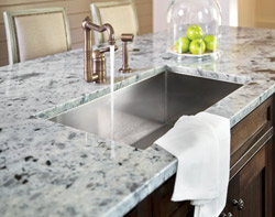
“We originally had another faucet in mind, but I actually like the substitution—this bronze-y Rohl fixture—better. It has a nice, old vintage look to it that was in keeping with the house and its 1920’s feel.”
While designer Shon Parker originally signed on to renovate just the kitchen of this Garden Hills home, the homeowner was so thrilled with his work that she recruited him to redesign her entire house, with the new kitchen as its nucleus. “The house was built in the 1920s, for a different era,” says Parker. “Life has changed and functions have changed since then.” Working with assistant project manager Laura Sharp, Parker merged the once “dead space” of the study with the original kitchen to create a new, larger room. Also expanding the look, a series of arched doorways draw the eye all the way to the back of the house.
The island, which is the room’s centerpiece, takes its cues from the architectural details of the neighborhood. Specifically, Parker combined a circle and square into an open fretwork motif, creating a bold visual statement. The island’s slightly curving shape also softens the lines of the room and accommodates breakfast stools easily. Like the cabinets, the island was built by Diversified Cabinet Distributors, and attracted attention, Parker says, before it even left the warehouse. “Sharon Pauly said everyone was clamoring to know what was in the box,” he laughs. A slab of rare, ice pearl granite from G&L Marble spans the top and “has a sort of iridescence that sparkles as you walk by,” he says. “I love the coloration of the gray and black together with the royal blue, which is one of the homeowner’s favorite colors.” Michael O’Keefe of Home Rebuilders collaborated with Parker to create construction plans, tweak final details and execute Parker’s designs with architectural precision. The finished look speaks proudly of Parker’s passions for design and personalization, which is exactly what makes this space tick.
RESOURCES
CUSTOM CABINETRY Diversified Cabinet Distributors RANGE HOOD Five Star STOVE Five Star REFRIGERATOR KitchenAid DISHWASHER KitchenAid COUNTERTOPS Walker Zanger SINK Blanco America FAUCET Rohl HARDWARE Architectural Accents WOOD BEAMS Carlisle Wood Plank Flooring BARSTOOLS Max & Co. ACCESSORIES Shon Parker Design Inc. BACKSPLASH TILE Walker Zanger WALL COLOR Benjamin Moore, Berkshire Beige TRIM COLOR Benjamin Moore, Manchester Tan PANTRY COLOR Benjamin Moore, Texas Leather
DESIGN DETAILS
INTERIOR DESIGN
Shon Parker
Shon Parker Design Inc., Atlanta
(404) 784-7463
shonparkerdesign.com
ARCHITECTURE
Michael O’Keefe
Home Rebuilders, Atlanta
(404) 876-3000
homerebuilders.com
ABOUT OUR JUDGES
MANDY CULPEPPER
MANDY CULPEPPER INTERIOR DESIGN
Mandy Culpepper’s love of design was inspired early by her mother and her mother’s design-savvy friends. From switching around furniture to scouring the countryside for the perfect antique treasure, Culpepper knew that her career path would be in interior design. After receiving her Bachelor of Fine Arts degree from the University of Georgia, Culpepper worked for Ferry, Hayes & Allen, one of Atlanta’s premier commercial interior design firms. She started her own company in 1991, and offers full-service commercial and residential design, from drawings to furniture selection to finishing details.
CHARLES HEYDT, ARCHITECT
PAK HEYDT & ASSOCIATES
Atlanta native Charles Heydt graduated with a degree in architecture from the Georgia Technical Institute in 1991. While completing his undergraduate studies, providence landed Heydt in the architectural firm of Norman Askins, where he worked for eight years. Studies in Rome and across Europe followed, and Heydt received his Master’s from the University of Notre Dame in 1998. He soon joined Yong Pak’s rapidly growing practice, and the firm was renamed Pak Heydt & Associates in 2003.
JENNIFER HICKS, CKD
CRUICKSHANK REMODELING
Jennifer Hicks is currently a Design Consultant for Cruickshank Remodeling. Hicks has worked with the award-winning Design/Build firm for nearly three years and has been in the architectural industry for more than eight years. She has worked with clients throughout the Southeast and the Caribbean, both in the residential and commercial arenas. Hicks holds a Bachelor of Fine Arts degree in interior design from the University of Georgia.
TRACY HUGHES, CKD
INDEPENDENT
Tracy Hughes is a professional kitchen designer with more than 23 years experience remodeling homes throughout the Atlanta area. A graduate of O’More College of Design and Architecture in Franklin, Tennessee, and a member of the Georgia chapter of the National Kitchen and Bath Association, her designs have been featured in Southern Living, Atlanta Homes & Lifestyles and Home Remodeler’s magazines.


