Guest Blogger: Design Galleria Kitchen & Bath Studio, Part V
Editor’s note: To kick off showhouse season, we’ve asked Design Galleria Kitchen and Bath Studio for a sneak peek into the firm’s design process as it prepares for the opening of the 43rd annual Decorators’ Show House & Gardens on April 26.
The firm’s task: To update not one, but three spaces in the historic Atlanta mansion, built in 1926 with a prominent location on West Paces Ferry. With just six weeks until the Show House’s official opening, Design Galleria takes over AH&L’s blog to chronicle their adventures in remodeling.
With the cabinets installed and the finishing touches being put into place, all of us at Design Galleria Kitchen and Bath Studio are very excited to show you the exquisite finishes that have been selected for the kitchen, master retreat and pool house. We know how important is when selecting a finish for the cabinetry or stone for a countertop that you make the right selection not only for your family and lifestyle, but also to make sure that you don’t “date” your home quickly.
When the team first got together to talk about the color palette for the kitchen, each designer had the chance to share their thoughts on trending colors, door styles and countertop selections. With five creative minds coming together, this was not only fun but also interesting to learn about what our clients were asking for in our own projects. What transpired is the collection seen below of soft hues with the dramatic gold tones you will see throughout the cabinetry on the hardware.
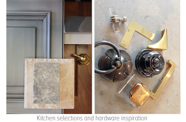
The La Cornue range and matching hood in black with unlacquered brass in the kitchen creates the most dramatic impact.We truly feel that these finishes are perfect in keeping with the historical significance of the home.
The master suite, as written about in our previous post, has been a great inspiration to us and we are very proud of its transformation. While selecting the final finishes for this space, we were very specific about keeping a sense of neutrality in the space while using the same finishes throughout.
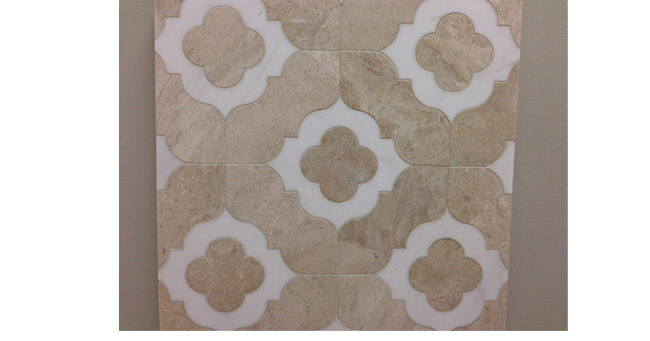
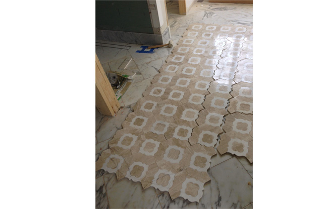
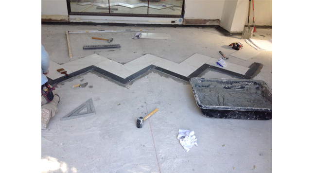
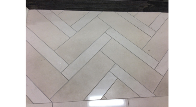
The selections for the pool house followed and there was a great sense of agreement that since this was an incredibly fun space, the finishes and patterns within it should enhance that ambiance. With a throwback, if you will, and a twist on the modern, we put a unique turn on the classic black-and-white theme. The herringbone pattern seen below is laid in a black and white alternating pattern and the plumbing fixtures in this area are all polished chrome. This area is perfect for entertaining friends and family.
This was a fantastic experience and we are all so proud to be a part of such an amazing project. We had a lot of fun watching everything evolve over these last several weeks and we hope everyone enjoys the spaces as much as we do.
Next week: Please join us for our final reveal of Design Galleria Kitchen and Bath Studio’s contribution to the 2014 Atlanta Symphony Associates’ Decorators’ Show House and Gardens.


