Week 2 of a Traditional Kitchen Design: Function, then Fun
Editor’s Note: The 2010 Atlanta Symphony Associates Decorators’ Show House & Gardens opens April 17 at 3639 Tuxedo Rd. We’ve once again invited kitchen design extraordinaire and Design Galleria principal Matthew Quinn to to keep a journal of the process, every step of the way. Today is his second installment about how the kitchen is taking shape. Look for a new installment every week until the Show House opens.
The new kitchen layout illustrates a few features that are unique to kitchen designs in the last few years.
- Children participate more in the preparation of a meal. With the popularity of the Food Network channel and shows like Top Chef and Hell’s Kitchen, kids want to learn to cook and experiment with new foods. Therefore, today’s kitchen plans have to be able to accommodate multiple cooks with clearly defined zones, wider aisles, lots of countertop space and sometimes more appliances.
- The Smartphone has virtually eliminated the need for a real desk in a kitchen. Email, calendars, phone directories are all at our fingertips; so besides a place to stash mail, some recipes, stationary, and grocery lists, a stool at the island will usually fit the bill.
- We shop for groceries more often now and purchase fresher foods. Therefore, we don’t need as much freezer capacity. However, the variety of foods we purchase and consume is greater so today we actually need more refrigerator and pantry storage.
- The days of one set of everyday china are gone. From our favorite cooking shows and restaurants we have learned that presentation is half the meal. Lots of affordable dinnerware in many shapes, colors and patterns is a must for today’s kitchen which makes two dishwashers the norm.
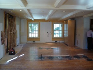
The most noticeable difference is the island orientation. Two square islands running lengthwise will eliminate the traffic issues one long island would cause with multiple cooks. Two islands will also provide more usable countertop space than one large island. But no worries, we have both bases covered. Out from under the seating island, a large wood countertop will slide out and connect both islands, in case that was preferred by whoever was cooking that day. The desk was eliminated and will be replaced with two 36” wide Dacor refrigerators with bottom freezers. Putting these large units on this side of the kitchen will also make the view into the kitchen from the breakfast room much more appealing. From this vantage point, two side-by-side Dacor ovens, a trademark here at Design Galleria, will be topped with a mirrored hutch making this piece feel more like furniture rather than a standard oven cabinet. We are going to narrow the breakfast room opening by 6” and move some light switches to allow us to make the walk-in pantry 19” deeper which will add a significant amount of storage. The hood and rangetop will be in the same location as before due to venting restrictions but the sinks will be moved in front of the windows overlooking the front yard.
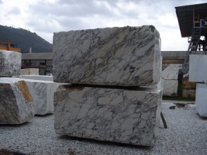
Now that we have a general layout that works, always function first, we can start selecting colors, materials and fixtures. I like to fall in love with one item and work the other materials choices around it. In this case, I flipped out over an enormous block of marble Magd Riad from Marmi Natural Stone found for me in rural Italy. He knew I was looking for something very special and texted a picture to me late one night; I instantly knew I had to have it so he made arrangements to have it sliced and sent over.
I can’t wait to share with you what else I found to complement this amazing marble.


