2010 Kitchen of the Year Contest
Whether your style is traditional, modern or somewhere in between, this year’s kitchen winners prove that, above all, a pared-down approach prevails
21ST ANNUAL KITCHEN CONTEST GRAND PRIZE WINNER
Minimalist Marvel
This modern take on a subtle and seamless kitchen without the extras still manages to deliver dramatic impact and sleek style
“The homeowner knows how he entertains and lives, and the rest was just extra,” explains designer Matthew Rao. “He didn’t want two of this, and three of this and six burners on the stovetop. He knew that a five-burner induction cooktop was plenty for him, a one-bowl sink was enough for him and one dishwasher in the kitchen was enough for him.” Many of the elements in the room were kept minimal to showcase the beauty of the surrounding outdoors, which command full view thanks to a towering gridded window. The Kohler Karbon faucet is angular to meld with the clean lines established in the space; because its design doesn’t require pullout attachments, it’s minimal, too.
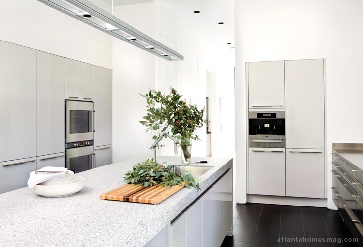
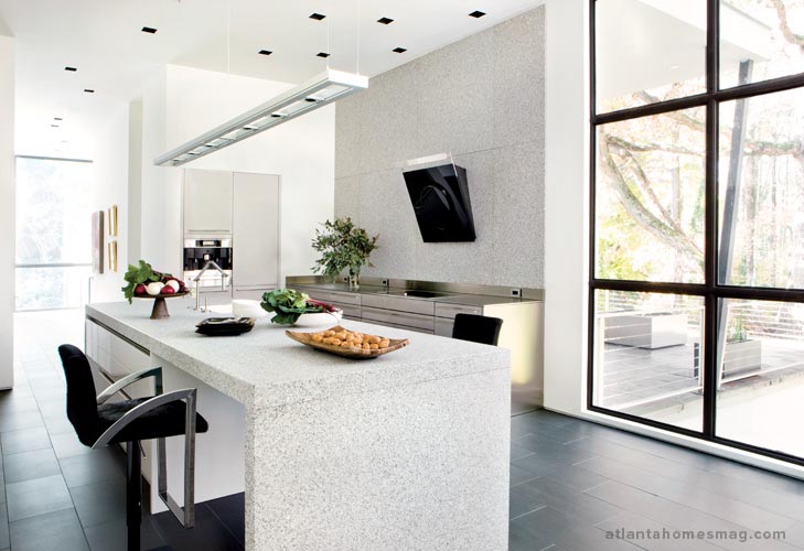
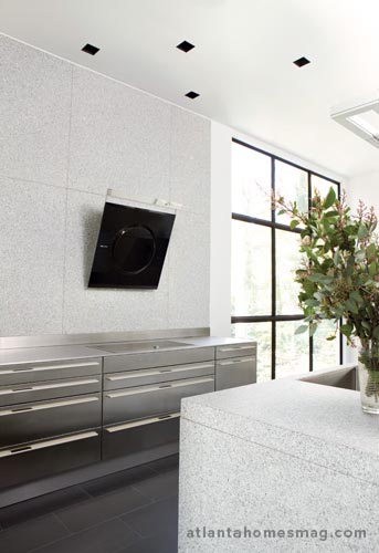 The number of finishes in the room was kept minimal—porcelain floor tiles, cut granite slabs on the walls, glossy pale gray laminate cabinetry and stainless steel, plus volcanic stone on the butler’s pantry countertops. Surfaces alternate between slick and ultra-matte to keep the look dynamic but not jarring. A repetition of strong rectilinear shapes and uniform cabinet widths maintains this continuity, each cabinet door revealing an unexpected element behind it—a wine cooler, storage pantries, refrigerator, freezer and more.

 “I thought I was already a minimalist, and then I realized there was another level that I had not gone to before,” he explains. “The challenge was having the confidence that I had done enough. We designed it the way we liked, and then we reduced and reduced and reduced.”Kitchen designer Matthew Rao had already worked on two modern kitchens with this discriminating homeowner, but this newest project lent the opportunity to take his work to new heights.
The home’s architect, Andy Armstrong, had devised an open floor plan, its first floor composed of five major spaces that flow into one another and place the kitchen in full view. Rao installed tall cabinets to blend in subtly with the wall, providing plenty of storage and disguising appliances—the refrigerator, freezer, even a wine cooler—at the same time. Because there’s little exposed hardware, the cabinetry blends in seamlessly, letting the grid of windows take center stage.
A combination island/breakfast table can accommodate four but is most often accompanied by two black cowhide-covered stools—a selection of interior designer Sharon Kiss, who chose them for the warmth and whimsy they add to the otherwise austere room. The homeowner loves that he can easily spread out a newspaper, sip coffee and watch the morning news with plenty of room to spare. And a cup-warming drawer directly beneath the Miele coffee system entertains this favorite luxury.
Making this space even more distinctive is the hood, a futuristic design by Zephyr; it hovers along the wall like an objet d’art. And a slick, stainless steel backsplash offers a simple transition from the countertop to the granite featured on the walls.
Perhaps the most defining feature of this kitchen is not the space itself but, instead, its architectural homage to the outdoors. Rao made a point of showcasing an amazing tree canopy beyond the tall gridded window—the true mark of a designer who knows how to make a kitchen speak not for what it screams, but what it says quietly.
KITCHEN DESIGN Matthew D. Rao, CKD, Rao Design Studio Inc., 938 Peachtree St., Suite 150, Atlanta 30309; (404) 815-5655; raodesignstudio.com
ARCHITECTURE Andy Armstrong, Armstrong Associates Architects, P.O. Box 820, Roswell 30077; (678) 361-6484
CONTRACTOR Joe Noah, Noah & Associates, 1750 Peachtree St., Suite 250-D, Atlanta 30309; (404) 347-3550; noahandassociates.com
INTERIOR DESIGN Sharon Kiss, Ambiance Interiors, 45431 Greenling Cr., Mendocino, CA 95460; (707) 962-0808; sharonkiss.com
21ST ANNUAL KITCHEN CONTEST WINNER
Heart of the Home
A renovated kitchen for a downsizing couple becomes a cozy backdrop for gatherings of family and friends

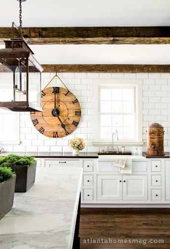
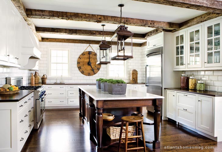 The classic walnut island was actually a creative collaboration among all members of the design team—even one of the homeowners. “We were wandering through Scott’s [Antique Market] and Amy saw an antique farm table and said, ‘that would be perfect for your island, but it’s too small,’ ” recounts the homeowner. “So, I sketched it up, showed it to Brad, and he remade it just like that piece of furniture but in a larger, island size. It looks so much like the original.”
“A lot of designers try to reinvent the way we live as opposed to updating traditional style,” notes architect Bradley Heppner. Working with interior designer Amy Morris, he created a kitchen that has many traditional elements, but still feels modern and clean, thanks in large part to the spacious tiled wall and minimal wall cabinetry. The two also took great care to balance design elements in every detail. Even the unconventionally large bead on the cabinetry works with overscaled elements such as salvaged-wood ceiling beams and oversize lanterns.
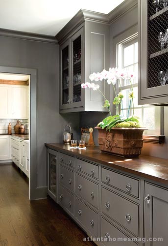
The darker, more dazzling butler’s pantry boasts a rich gray finish and a formal paneled wall that hides extensive storage and a microwave neatly out of sight.
“We wanted to keep the colonial, traditionally based look the homeowners wanted, but make it clean and functional,” says Morris. “One of the things that makes it so modern is that there is no upper cabinet wall.” Instead, the designer installed beveled white subway tiles from the countertops all the way to the ceiling, using gray-tinted grout to really make the tiles pop.The heart of this renovated Brookhaven home, designed by architect Bradley Heppner and interior designer Amy Morris, is a kitchen that’s all about balance. The owners were downsizing from a larger house, but wished to retain all of the character, function and spaciousness of their former abode.
Rustic touches, like salvaged wood beams, add warmth while laying the groundwork for the scale of more decorative elements, including large lanterns and a statement-making island. Though it’s packed with storage space, the island retains an airy appearance, while the focal point of the room, a large antique wooden clock—permanently stuck at 5:00 cocktail hour—serves as a conversation piece.
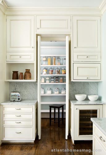
To maximize storage, the lower cabinetry is primarily made up of drawers, with additional storage carved out in adjacent spaces in order to maintain the kitchen’s streamlined look. In the nearby mudroom, a stairwell is outfitted with floor-to-ceiling cabinets, the perfect place for cleaning supplies. And there’s more storage in the pantry, discreetly located behind a paneled wall in the butler’s pantry hall.
There’s balance, too, in the colors and materials chosen by the designer. “If you change the color of the island from the rest of the cabinetry, then the countertops need to change, as well,” she explains. Thus, Morris decided against using marble on the perimeter, opting instead for walnut surfaces—a reverse of the colors used on the island—to complement the room’s warm, rich feel.
INTERIOR DESIGN Amy D. Morris, Amy D. Morris Interiors, 1401 Dresden Dr., Suite 200, Atlanta 30319; (404) 389-0628; amydmorris.com
ARCHITECTURE Bradley E. Heppner, Bradley E. Heppner Architecture, 574 Hascall Rd. NW, Atlanta 30309; (404) 734-6687; bradleyeheppner.com
21ST ANNUAL KITCHEN CONTEST WINNER
One to Grow on
The serene kitchen of a new home in Garden Hills fulfills the needs of children, company—and the consummate cook

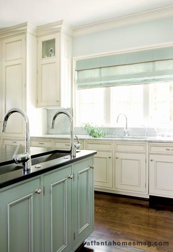
A custom double trough sink allows ease of preparation for multiple cooks, while the main sink sits under a sunny window nook, its simple Roman shade providing a subtle design statement.
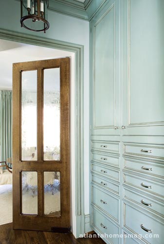
In the butler’s pantry, a dozen drawers lined with Pacific Silvercloth keep the family’s silverware organized and tarnish-free while an old-fashioned seeded glass door provides separation between the butler’s pantry and formal dining room to preserve the quiet elegance of that space.
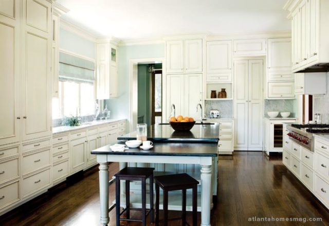
In tandem with rich walnut floors, warm vanilla cabinetry—custom-built by Design & Cabinetry—creates a soft glow in a space where bright white might have come off as stark. The pale blue-green of the walls was borrowed from the palette used throughout the first floor. And for the large island, Rabaut used a color in the same hue as the trim in the adjacent rooms, teaming it with a warm antique glaze to both warm up the palette and establish separation from the adjoining spaces. It’s joined on one end by a table that can be rolled to wherever it’s needed most, serving as a buffet or impromptu workstation.For the kitchen of their Garden Hills home, interior designer Jo Rabaut’s clients came to her requesting a room that Martha Stewart would happily call her own—beautiful and highly functional—but well-equipped for their young children, too.
Many of the elements that normally command full view in the kitchen—including the microwave, refrigerator and china cabinet—are concealed by paneled walls to keep the look understated. In fact, the owners also chose to forgo “statement pieces” such as a prominent hood, central chandelier or pot rack. Instead, a rich soapstone countertop on the island anchors the room, providing a handsome, tactile surface on which to prep, with a double trough sink enhancing efficiency. And to keep the kitchen child-friendly, the lower cabinets are equipped with a magnetized locking system.
In the butler’s pantry, a darker finish imparts a glamorous look for the paneled wall of silverware drawers and cabinets designed to store sparkling cut crystal. The seeded-glass door separates the spaces with elegance, providing the perfect pass-through to the dining room beyond.
INTERIOR DESIGN Jo Rabaut, ASID, IIDA, Rabaut Design Associates Inc., 349 Peachtree Hills Ave. NE, Studio A4, Atlanta 30305; (404) 233-1024; rabautdesign.com
ARCHITECTURE William T. Baker, William T. Baker & Associates Ltd., 78 West Wesley Rd., Atlanta 30305; (404) 261-0446; wtbaker.com
CONTRACTOR Ron Lester, 2050 Shillings Rd., Kennesaw 30152; (404) 456-0373
ABOUT OUR JUDGES
Holly Balint, CKD, holds a degree in interior design from American Intercontinental University. In 1999, Balint started her interior design business, Eastern Perspective Inc., which she eventually transitioned to kitchen design. “My concentration is in the kitchen but [the design] needs to flow and fuse with the spaces it’s connected to,” she says. World influences make their mark on her designs, too, each boasting a strong focal point and soft, muted hues. Balint predominately works with new home builders in the North Fulton area.
Reynolds J. Brown, vice president at Stan Topol & Associates Inc., graduated from the Georgia Institute of Technology with an undergraduate degree in architecture. But, after using his architectural degree for a few years, Brown discovered a passion for interiors; in 1986, he began his interior design career with Stan Topol where he works on high-end residential, corporate and hospitality projects and serves as senior project leader. Brown’s work with Stan Topol & Associates has been published in Atlanta Homes & Lifestyles, Atlanta Magazine, Veranda, and MidSouth magazine.
A graduate of the University of Tennessee, Thomas A. Caswell, CKD, founded Brookwood Kitchens Inc. (BKI) in 1988, working primarily throughout the eastern United States but also as far north as Long Island, New York, and as far south as Boca Grande, Florida. Caswell specializes in kitchens and baths, although he has designed and executed many whole-house renovations. In addition to being a Certified Kitchen Designer, Caswell has also served as a licensed general contractor on projects in a range of sizes for the past 29 years.
The owner of South of Market, Kay Douglass has had a successful design business in Atlanta for 13 years, and maintains the shop’s second location in Charleston, South Carolina, as well. Her buying trips to Europe have yielded an interesting array of lighting, antiques and unusual objects which she tends to use in creative new ways. Her work has been recognized by the Best of Atlanta design awards 2003-2008 and she’s been featured in House Beautiful, Traditional Home, Atlanta Homes & Lifestyles and Architectural Digest. She was joined in 2001 by Dixie Peeples, who
assists at the shop and with design projects.


